

Loading dashboard information...
Loading dashboard information...
Interactive Plotly Dash dashboard for real-time data visualization and analysis, offering dynamic charts and user-friendly interface for insightful decisions.
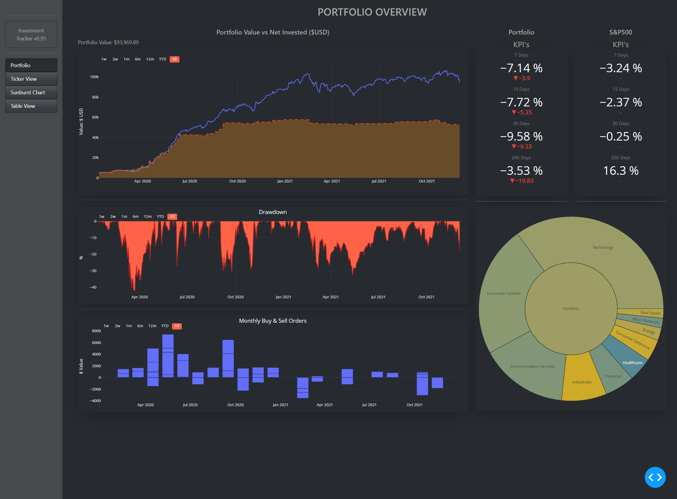
This Plotly Dash dashboard excels in providing real-time data visualization, allowing users to monitor and analyze data as it updates. With its interactive elements, users can seamlessly explore different data points, filter information, and gain insights instantly. The dashboard is designed to handle large datasets efficiently, ensuring that users experience minimal lag and maximum performance.

This Plotly Dash dashboard is ideal for data analysts, business intelligence professionals, and decision-makers who require real-time insights into their data. It's also suitable for educators and researchers who need a powerful tool to visualize complex datasets. Additionally, businesses looking to enhance their data-driven decision-making processes will find this dashboard invaluable.
Other dashboard tools that work with Fugo
.svg/1200px-Microsoft_Office_Access_(2018-present).svg.png)
Streamline your data management with the Microsoft Access dashboard, offering intuitive insights and seamless database interactions for efficient decision-making.

Explore interactive visualizations and data insights with the Plotly dashboard, designed for dynamic data analysis and real-time decision-making.

Explore interactive data visualizations and analytics with the R Shiny dashboard, designed for real-time insights and user-friendly data exploration.