

Loading dashboard information...
Loading dashboard information...
Explore interactive visualizations and data insights with the Plotly dashboard, designed for dynamic data analysis and real-time decision-making.
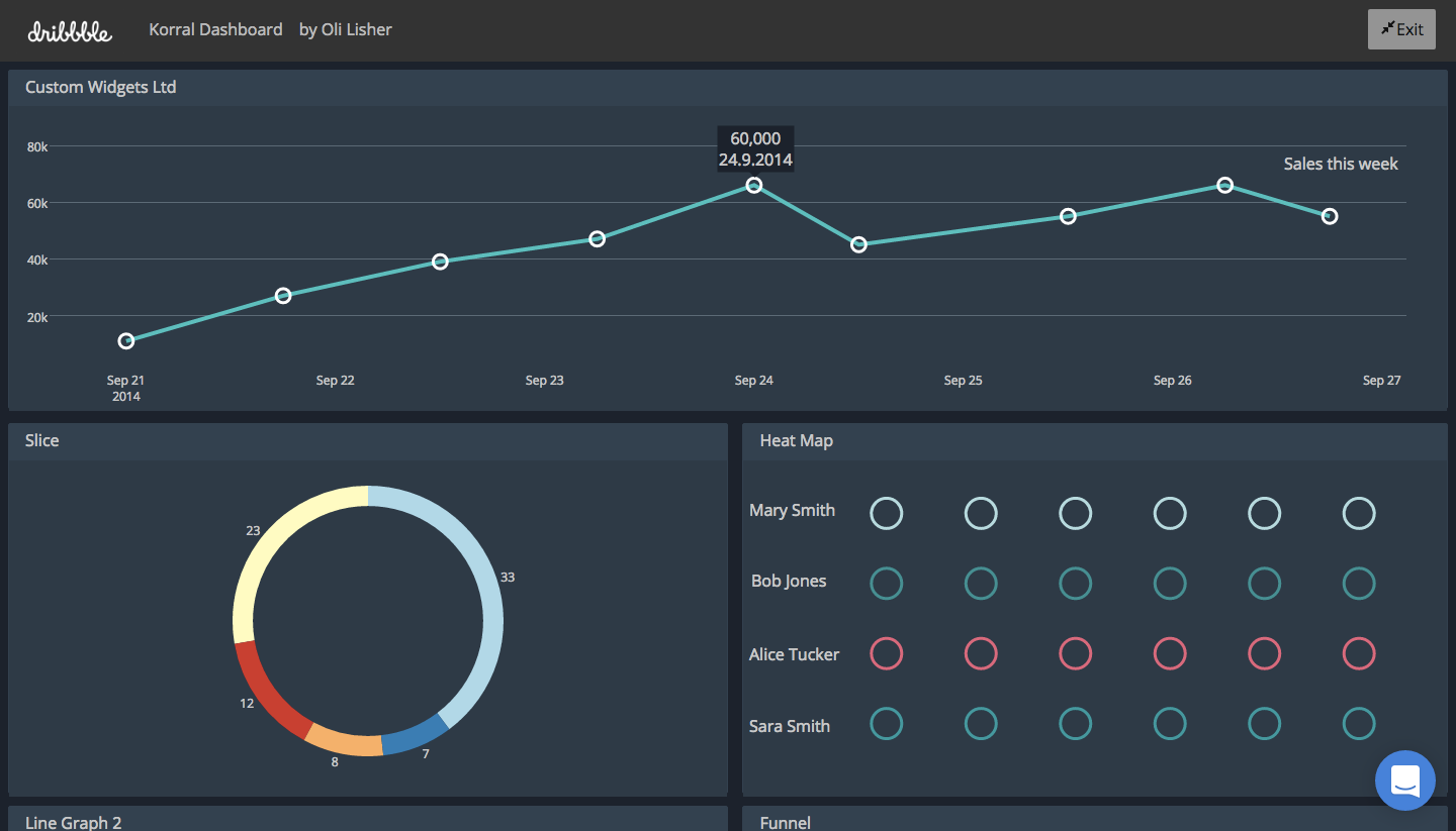
The Plotly dashboard offers a robust platform for creating interactive data visualizations. Users can effortlessly transform complex datasets into engaging charts and graphs. With its intuitive drag-and-drop interface, you can customize visuals to highlight key insights, making data analysis both accessible and impactful. The dashboard supports a wide range of chart types, including line plots, scatter plots, bar charts, and more, all of which can be easily embedded into reports or presentations.

The Plotly dashboard is ideal for data analysts, business intelligence professionals, and decision-makers who require a powerful tool for data visualization and analysis. It caters to users across various industries, including finance, healthcare, and marketing, who need to derive actionable insights from their data. Whether you're a seasoned data scientist or a business leader looking to make data-driven decisions, the Plotly dashboard provides the functionality and flexibility to meet your needs.
Other dashboard tools that work with Fugo

Visualize data effortlessly with Infogram's interactive dashboard, offering dynamic charts, maps, and infographics for impactful presentations.
.svg/1200px-Microsoft_Office_Access_(2018-present).svg.png)
Streamline your data management with the Microsoft Access dashboard, offering intuitive insights and seamless database interactions for efficient decision-making.

Interactive Plotly Dash dashboard for real-time data visualization and analysis, offering dynamic charts and user-friendly interface for insightful decisions.