

Loading dashboard information...
Loading dashboard information...
Visualize complex data effortlessly with the ECharts dashboard, offering interactive charts and graphs for insightful data analysis and presentation.
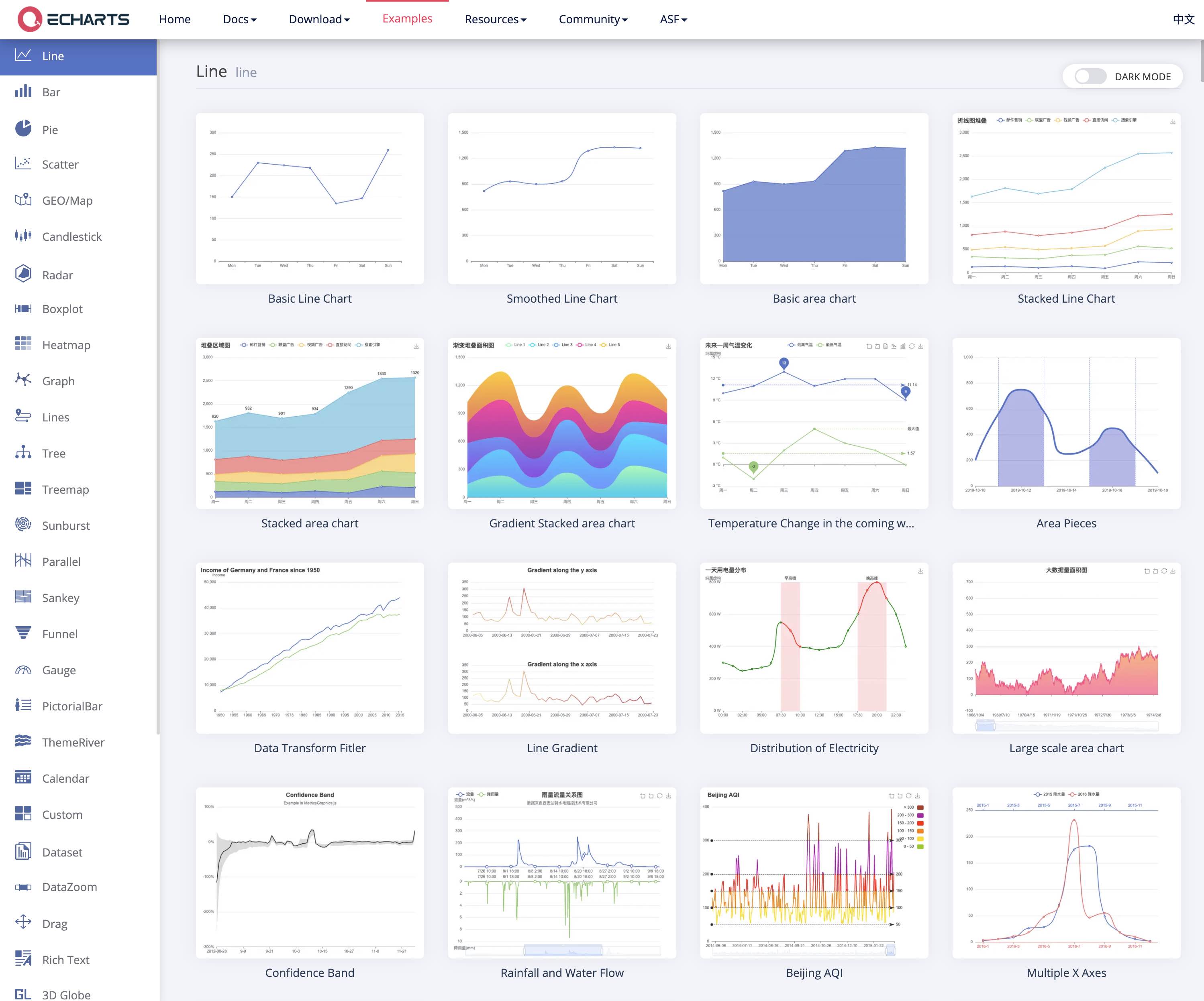
The ECharts dashboard excels in transforming raw data into visually appealing and interactive charts. It supports a wide range of chart types, including bar, line, pie, scatter, and more. With its powerful rendering engine, ECharts can handle large datasets with ease, ensuring smooth performance and real-time data updates. The dashboard's customization options allow users to tailor the appearance and behavior of charts to meet specific needs, making it a versatile tool for data visualization.

The ECharts dashboard is ideal for data analysts, business intelligence professionals, and developers who need to present data in a clear and engaging manner. It's also suitable for educators and researchers who require a robust tool for visualizing complex datasets. Whether you're working in finance, marketing, healthcare, or any other data-driven field, ECharts provides the flexibility and power needed to create impactful visualizations.
Other dashboard tools that work with Fugo

Gain insights into your subscription business with ChartMogul's comprehensive dashboard, offering real-time analytics and performance metrics.
Explore DataRobot's intuitive dashboard for seamless AI model management, offering real-time insights and predictive analytics to drive business decisions.

Efficiently transform, analyze, and visualize data with the Excel Power Query dashboard, streamlining your data management process effortlessly.