


Today we’re rolling out a redesigned version of the Fugo CMS!
At first glance the change is visual. The interface has been rebuilt with a new layout, faster navigation, and a set of tools that make it easier to work across screens, playlists, media, and dashboards without constantly jumping between pages.
But the redesign is about more than aesthetics. It reflects a shift in how screens are actually used once a deployment grows beyond a handful of displays.
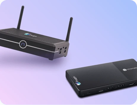
Digital signage systems usually start out simple. You create some content, build a playlist, publish it to a screen, and let it run. That model still works well for campaigns, announcements, and evergreen messaging.
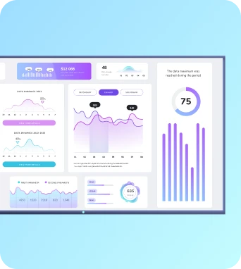
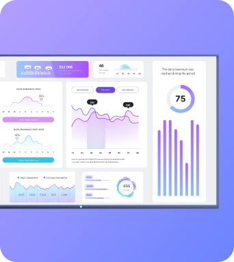
Over time, though, screens start taking on a different role. They begin showing dashboards. Teams want alerts from systems like CRMs or ticket queues. Operational metrics appear alongside announcements. What started as a publishing tool gradually becomes part of the information flow inside the organization.
When that happens, the challenge isn’t publishing content. It’s operating the system that keeps all of those screens running.
The new Fugo CMS is designed for that reality.
Ready to dive in? 👉 Try it now
Why we rebuilt the CMS
Software interfaces tend to accumulate history. Features arrive over time, each solving a real problem, but the structure around them doesn’t always evolve at the same pace.
The original Fugo CMS served us well for years, but the platform itself has grown significantly. New integrations, dashboards, automation tools, and planning features expanded what screens could do. Eventually it became clear that the interface needed to catch up with the system behind it.
Rather than layering improvements onto the existing structure, we decided to rebuild the CMS around a few simple principles:
- Navigation should stay predictable as the platform grows
- Everyday tasks should require fewer context switches
- New capabilities should be able to appear without making the product harder to understand
What’s new in the redesigned CMS
Several changes become obvious the moment you open the new interface.
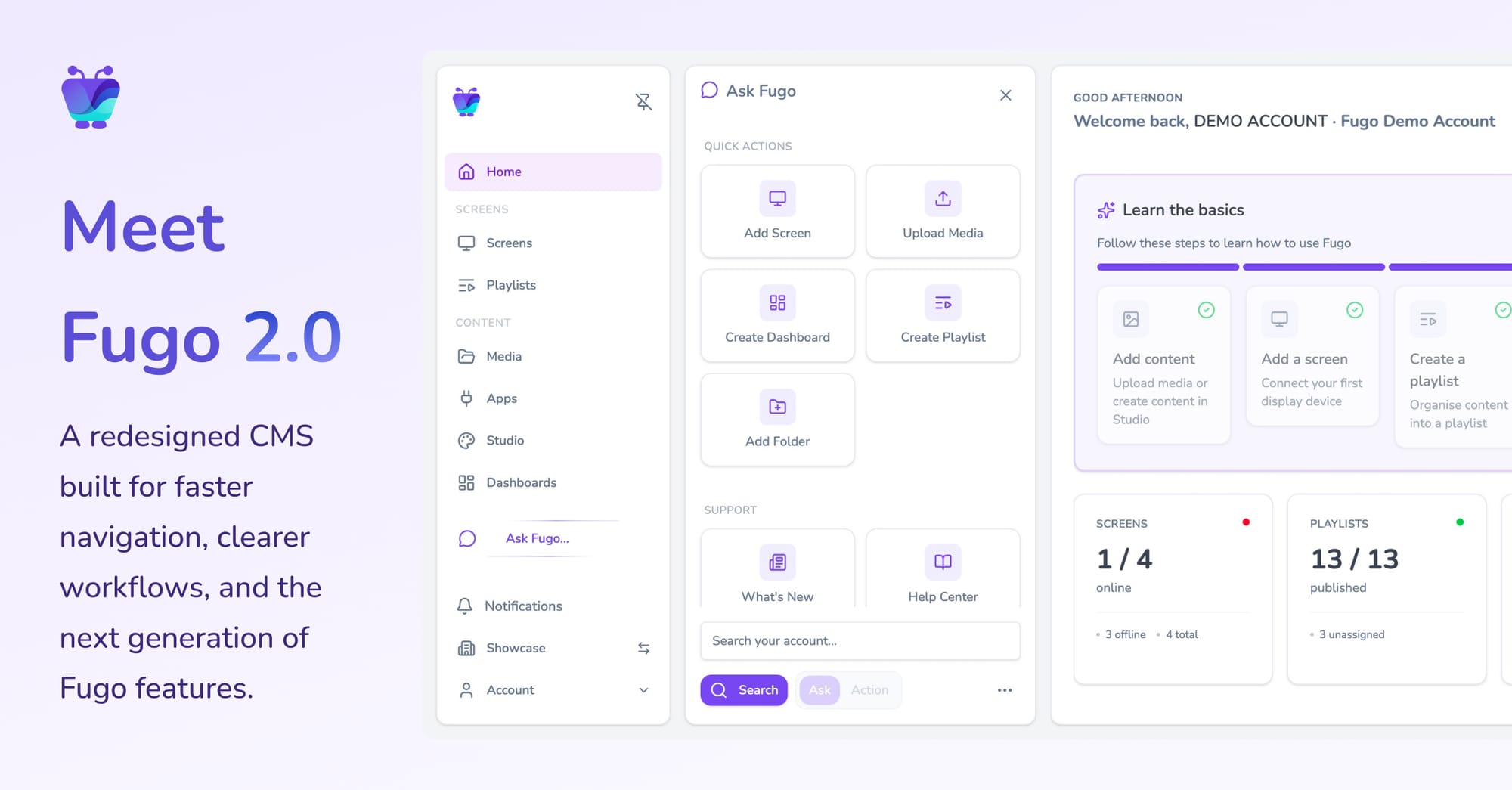
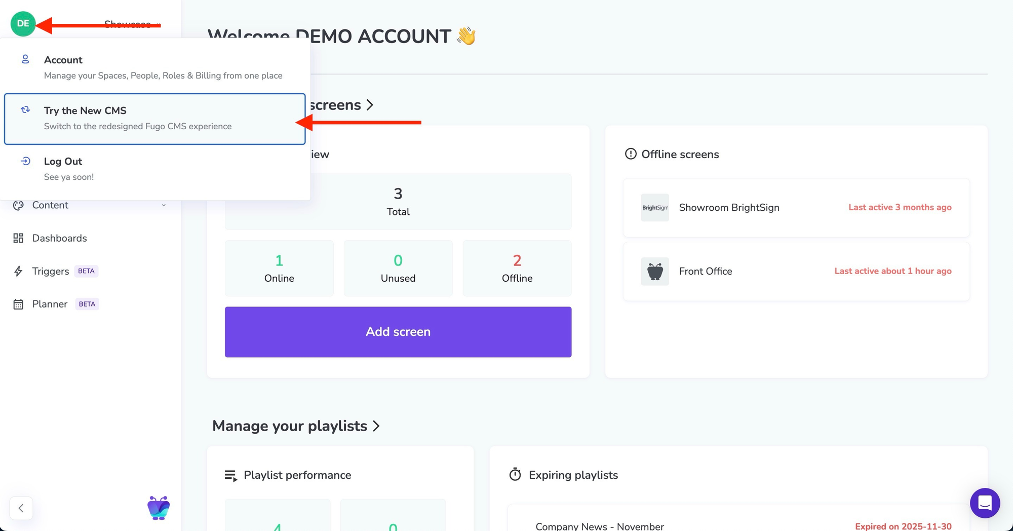
Sidebar navigation
The CMS now uses a persistent sidebar for navigation. This keeps the primary areas of the platform - screens, playlists, media, apps, dashboards, and triggers - visible at all times.
The result is less jumping between pages and a clearer sense of where you are inside the system.
Contextual side panels
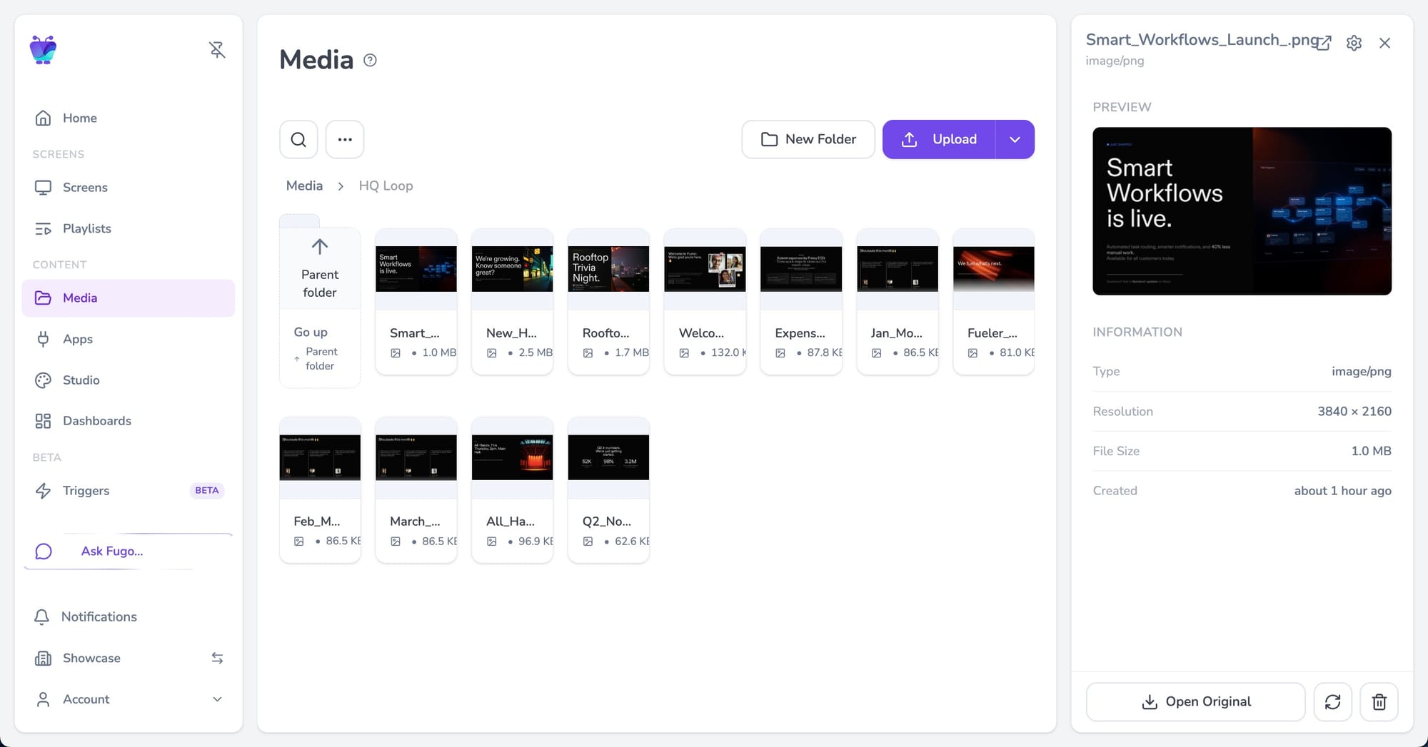
Many objects now open in side panels rather than full pages.
This means you can inspect screen settings, review media, or check playlist details without leaving the view you’re currently working in. It removes a surprising amount of friction when you’re moving quickly between tasks.
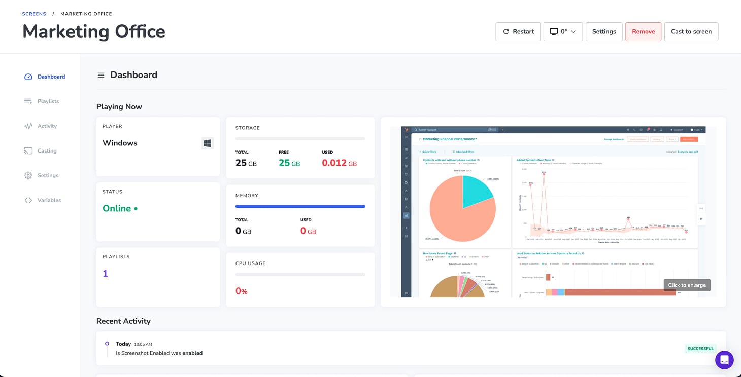
A redesigned home dashboard
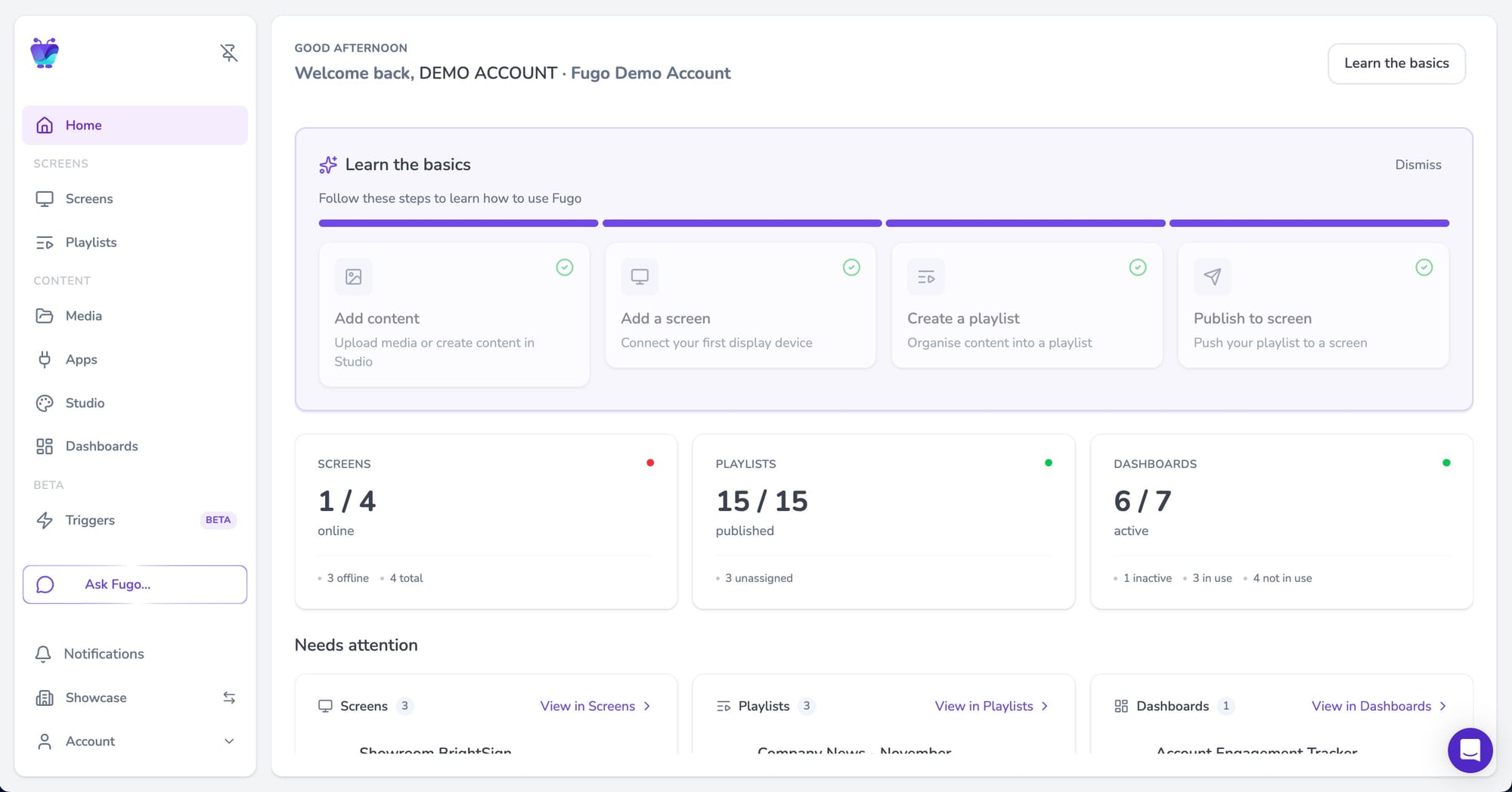
The home page now behaves more like an operational overview than a welcome screen.
It surfaces things that typically require digging through the interface:
- screen health and connectivity
- recently edited playlists and dashboards
- items that may need attention
Instead of navigating the CMS to find out what’s happening, the dashboard gives you a snapshot of your network the moment you log in.
New capabilities in this release
Alongside the redesign, this release introduces a few capabilities that didn’t exist in the previous CMS.
Floor plan view for screens
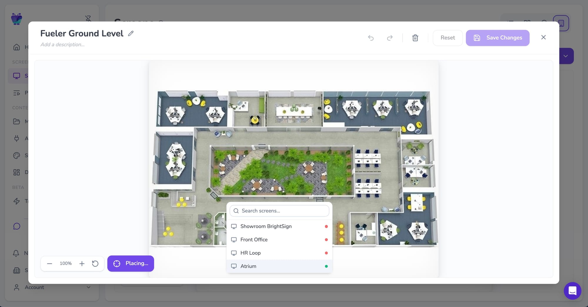
Teams managing multiple displays in a single location can now map screens directly onto a building floor plan. This makes it much easier to understand where devices are physically located.
Dark mode
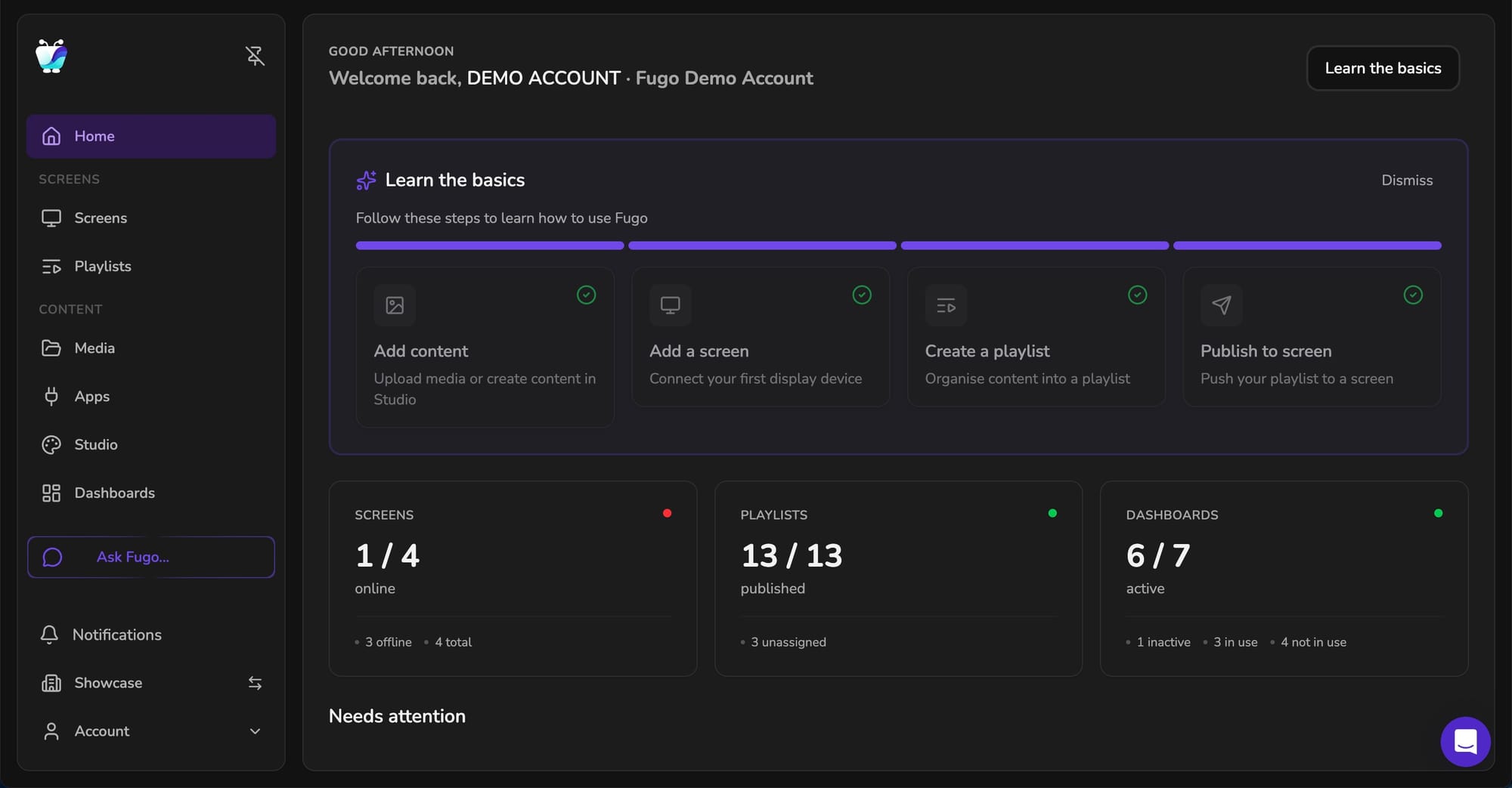
For teams who spend a lot of time inside the CMS, dark mode makes long working sessions easier on the eyes.
Salesforce trigger connector
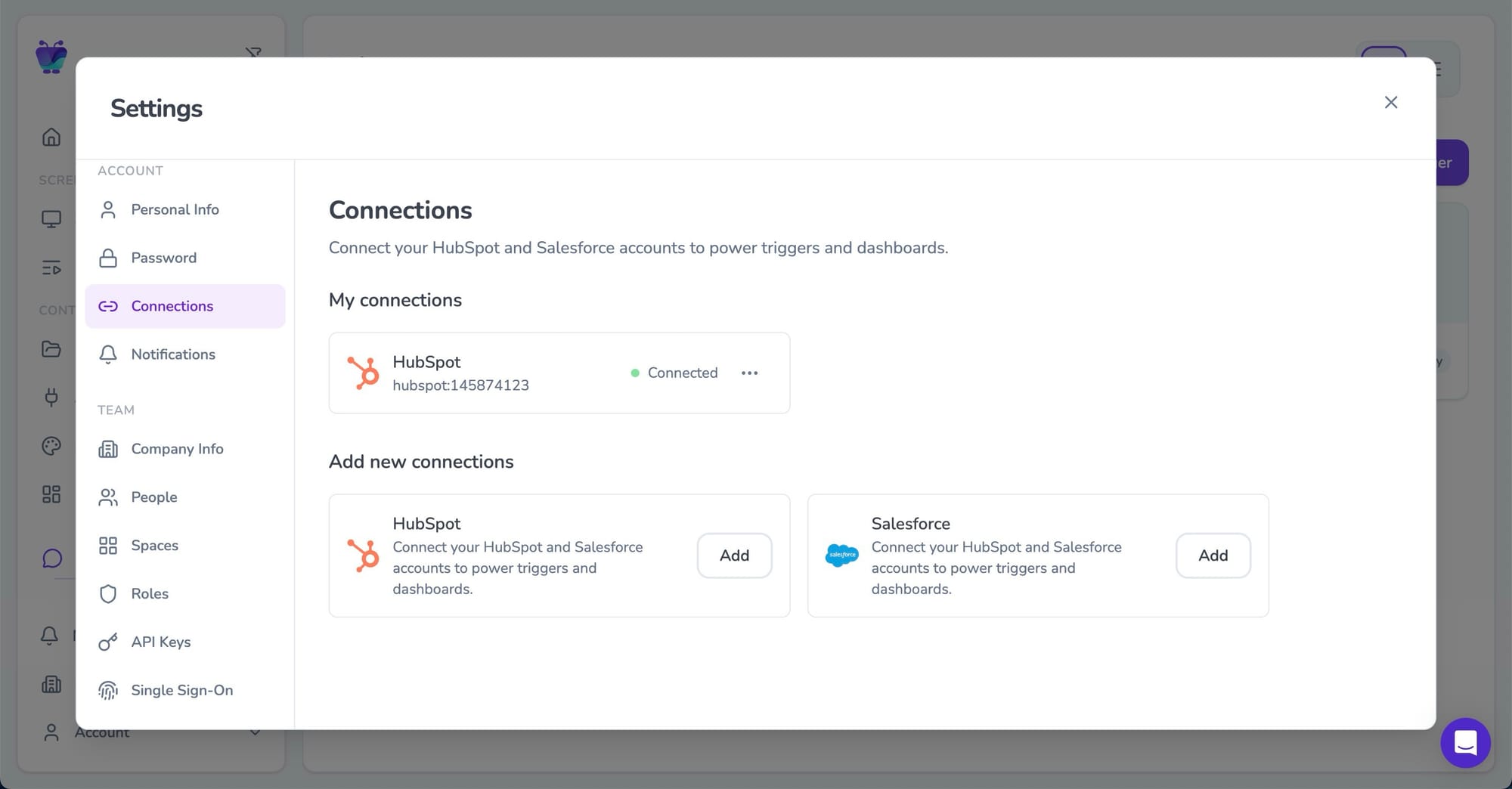
Many teams already use Fugo to display Salesforce dashboards on their screens - surfacing pipeline metrics, deal activity, and performance data across the organization.
With the introduction of Triggers last year, we started expanding beyond dashboards into event-driven screens, beginning with support for HubSpot.
Now we’re bringing that same capability to Salesforce.
The new Salesforce connector allows screens to respond automatically to events happening inside your CRM - for example when a deal closes, a milestone is reached, or key data changes. Instead of only displaying dashboards, your screens can now surface important moments from Salesforce as they happen.

Where this fits into the broader product
The CMS redesign didn’t appear in isolation. It’s part of a longer arc of work inside the platform.
Over the past year we’ve focused heavily on helping screens stay connected to the systems teams already rely on: dashboards, CRMs, operational tools, and internal data sources.
The redesign creates the interface foundation for that direction to continue.
Screens are gradually becoming something different from the traditional “playlist loop.” They’re evolving into shared surfaces for operational information - dashboards, alerts, metrics, and updates that need to be visible across a workspace.
What’s coming next
The new CMS is also where all future releases will land.
Some of those improvements are already visible in early form.
The Ask Fugo panel introduces a new space for search, support, and system navigation directly inside the CMS.
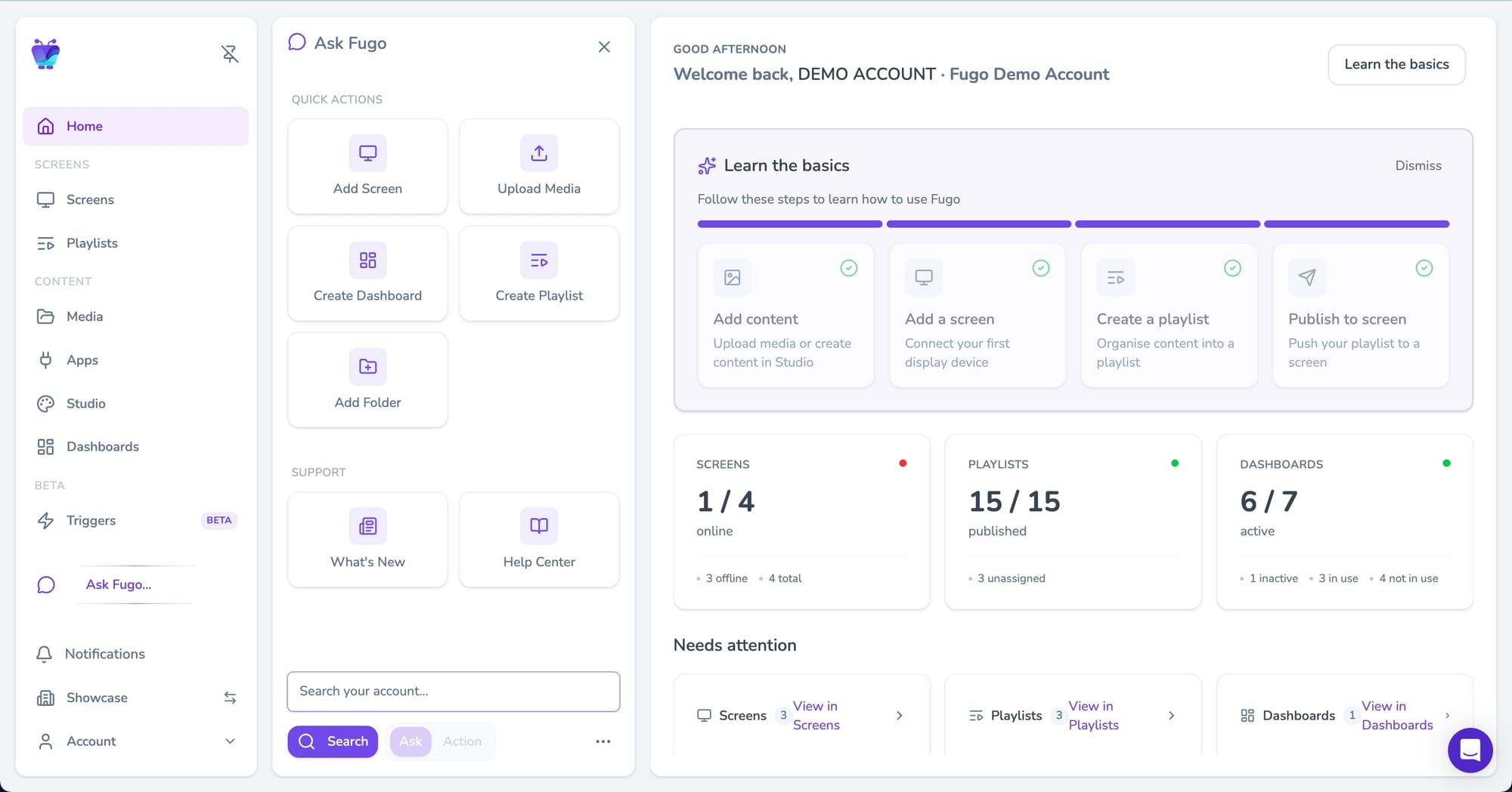
Over time it will expand into an AI-powered interface capable of answering questions about your account and helping you perform actions simply by describing what you want to do.
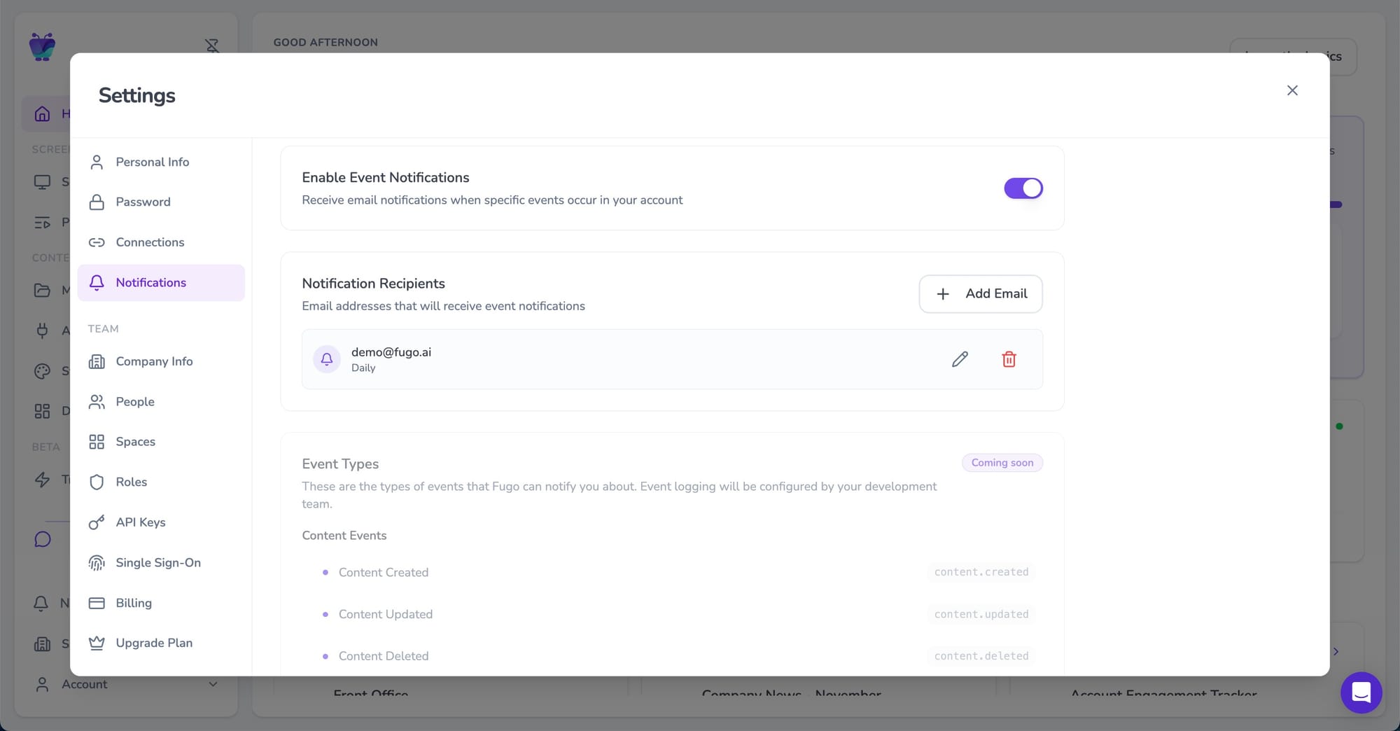
We’re also expanding event notifications so teams can track more system activity beyond basic screen connectivity alerts.
And the Planner, which currently provides visibility into playlist schedules, will become fully editable so teams can manage content timelines directly from the planner view.
Wwitching to the new CMS is the best way to access upcoming capabilities as they launch.
How the rollout works
The new CMS is launching through a phased rollout.
Existing customers will first see the option to switch to the new interface from within their account. During this period you can move freely between the classic CMS and the new one while exploring the redesign.
A phased rollout gives teams time to get comfortable with the new interface while we continue refining the experience based on real usage.
Eventually the new CMS will become the default for all accounts. Before that happens we’ll provide advance notice and guidance to help teams prepare.
You can find a detailed walkthrough of the new interface in our guide to Switching to the New Fugo CMS.
A new foundation for the platform
Some product releases are about adding features.
This one is about making space for them.
The redesigned CMS makes the platform easier to navigate today, but its bigger purpose is to support what Fugo is becoming: a system where screens stay connected to the tools and events that shape the day-to-day rhythm of a team.
Screens shouldn’t sit off to the side of that activity; they should reflect it.