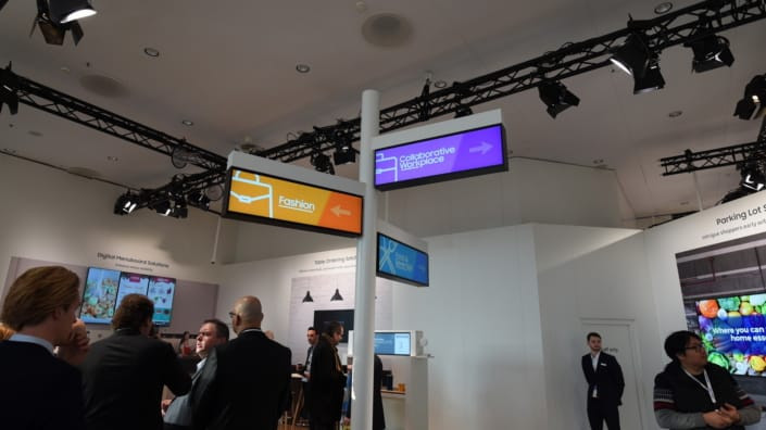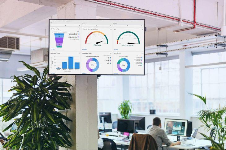
TV screens. We all know them, but most of us haven’t thought about using them for business intelligence. That’s changing. More teams are making critical dashboards visible, not just tucked away in browser tabs, but displayed in lobbies, bullpen areas, support pods, and beyond.
In this guide, we look at 8 business intelligence platforms our customers most often display on their workplace screens. For each, we break down what it's best at, what makes it screen-friendly (or not), and what you need to know to keep it visible, refreshed, and working reliably.
Quick comparison: BI tools at a glance
Just looking for the Sparknotes? 👇

1) HubSpot

HubSpot is a modular CRM platform that spans marketing, sales, service, content management, and operations. With tools like Sales Hub, Marketing Hub, and Operations Hub, it supports growing teams of all sizes from startups to enterprise orgs.
Each product tier includes built-in reporting tools that allow users to create dashboards for campaign performance, deal tracking, website engagement, and more. These dashboards are central to how teams manage day-to-day activities and measure growth across the customer journey.
TV display considerations
While HubSpot dashboards are easy to use within the platform, there’s currently no built-in feature to display them on external screens like TVs or digital signage. For teams that want ambient visibility - e.g. a live pipeline dashboard on a sales floor - this can create friction.
This has become a recurring topic in the HubSpot Community, with users asking about ways to surface dashboards beyond the browser tab or internal app environment.
Some common constraints include:
- Dashboards are tied to user accounts and role-based access
- There are no public or “read-only” view links for screen display
- Dashboards refresh at regular intervals, but lack real-time broadcast controls
How teams address this today
Some users opt for browser-based display tools or digital signage CMS platforms that can securely authenticate and display HubSpot dashboards in full-screen mode. These solutions often include screen scheduling, secure token storage, and refresh handling, making them helpful for teams who need at-a-glance performance data in shared spaces.
Pricing overview
HubSpot pricing depends on the product (e.g. Sales Hub, Marketing Hub, Operations Hub), team size, and plan tier. For example:
- Sales Hub Starter starts at $20/month
- Marketing Hub Professional starts around $800/month
- Operations Hub Professional starts at $720/month
- Enterprise plans go higher, with add-ons based on usage and seat count
There are also free tiers available for small teams or individuals.
Want to get your HubSpot dashboards on your office TV screens? We explain how here.
2) Power BI
Best for companies deep in Microsoft’s ecosystem

Power BI is the default BI choice for teams using Excel, SharePoint, Teams, and Azure. It scales well from departmental reports to full enterprise data governance. Plus, its AI visuals - like decomposition trees and Key Influencers - give even non‑technical users a way to build rich, insights-driven dashboards.
TV display considerations
Power BI wasn’t designed for screen display: dashboards require login, support no “TV mode,” and need a Pro license for viewing. While the Publish to web feature allows public embedding, it's intended for non-sensitive, public content and isn’t ideal for internal dashboards. Most teams that want dashboards looping on TVs opt for kiosks, signage platforms, or secure browser workflows.
Power BI features
- Native integration with Office 365, Teams, and Azure ecosystems
- Rich AI‐driven visuals: decomposition trees, Key Influencers, Q&A
- Publish to web allows embed code use—but only for public, non-protected data
Power BI limitations
- No native full‑screen or TV display mode
- Dashboards locked behind authentication - no internal "public" sharing
- Viewer licenses (Pro) required even for display
- Publish to web unsuitable for private/internal dashboards
Check out our full guide to displaying Power BI dashboards on TV screens.
Power BI pricing

- Power BI Pro: $10 per user per month for dashboard viewing access
- Power BI Premium: $20 per user per month for editing dashboards
- Power BI Premium Per Capacity: $4,995 per capacity per month for self-service data prep
3) Tableau
Best for data storytelling & presentation-worthy dashboards

If your team needs dashboards that go beyond grids - think interactive stories with drill-downs, filters, and polished visuals - Tableau is the go-to. It’s well-suited for marketing teams, analysts, or leadership who want to visually navigate their data.
TV display considerations
Displaying Tableau dashboards on TVs is possible, but there’s no out-of-the-box "TV mode." You need:
- A Display/Viewer license (or Core Server license) to legally show dashboards beyond the creator
- A browser loop via extensions, JS API, or signage tooling - native carousel or auto-refresh features are lacking
- A tested browser or casting system, as Smart TV apps aren’t officially supported
Many teams use digital signage platforms (e.g. Fugo, RocketScreens, OptiSigns) that take care of authentication, refresh control, and licensing so teams don’t DIY browser hacks.
Tableau features
- Strong for interactive exploration: live connections, drill-downs, filters
- Capable of real-time dashboard updates
- Rich visual storytelling toolbox
Tableau limitations
- No built-in looped or kiosk-style display
- Dashboard display for multiple viewers requires Display/Core licenses
- Browser loops often require extensions or manual scripting
- Smart TV compatibility is limited and unofficial
Tableau pricing

- Tableau Viewer: $15 per user per month to view dashboards (for office screen displays)
- Tableau Explorer: $42 per user per month to edit and view dashboards
- Tableau Creator: $70 per user per month to create, edit, and view dashboards
Trying to put your Tableau dashboards on TV screens? We've got a helpful guide for that!
4) Looker
Best for teams embedding analytics into internal tools or apps

Looker stands out when the goal isn’t just visualizing data, but integrating insights directly into your business workflows - whether that’s a customer portal, internal dashboard, or sales enablement platform. Its developer-first design, with LookML and embedding APIs, makes analytics feel like a native part of the user experience
If you already run on Google Cloud - especially BigQuery - Looker lets you define metrics once and reuse them everywhere, ensuring consistency across your product and internal tools .
TV display considerations
There’s no built-in “display mode” for TVs. Dashboards require authenticated sessions, and the platform expects embed flows to use signed URLs or SDK-based sessions. To show Looker dashboards on office screens, teams typically:
- Use the Looker Embed SDK to pull dashboards into a custom web app with secure iframe sessions
- Leverage third-party signage platforms that manage login, refresh, and screen rotation
Looker features
- Embed SDK and signed embeds for secure iframe integration
- Unified data modeling via LookML ensures consistent metrics across embedded and native BI contexts
- Granular security controls - including row-level access control - built into the embedded experience
Looker limitations
- No kiosk-style, TV-native display mode - embedding requires development
- Requires signed URLs or embed sessions - no public dashboard display unless using public embeds
- Custom embed experiences need developer support and maintenance
If you’re ready to display a Looker dashboard on your TV, feel free to use this quick start guide from Fugo.
Looker pricing

Looker has two different pricing considerations: per-user pricing, and per-platform pricing.
First, you need to pay for the Looker platform itself. This requires a custom quote from the Google team.
Second, you need to pay for users to access your Looker platform. This costs:
- Viewer User: $30 per user per month
- Standard User: $60 per user per month
- Developer User: $125 per user per month
5) Salesforce
Best for teams needing CRM-aligned metrics

If your sales, service, or marketing teams work inside Salesforce every day, its dashboards often become the default source of truth. No need for added data pipelines - they provide insight into pipeline health, campaign ROI, and rep performance.
TV display considerations
Salesforce lacks a native full-screen TV option. Dashboards must be accessed via browser, and there's no kiosk mode. Many teams use Chrome extensions or signage tools (like Fugo or RocketScreens) to send dashboards to TVs easily. Smart TV support is unofficial and may require workarounds.
Salesforce features
- Easy dashboards within CRM UI, no extra data layers
- Supports basic filtering and drill-downs
- Available via web browser (accessible on internal tools)
Salesforce limitations
- No full-screen TV mode or looping features
- Dashboard component limits (e.g., ≤ 20, ≤ 50 filters)
- Refresh requires manual interaction or API automation
If you're looking for a deeper dive on displaying Salesforce dashboards to TV screens, check out this guide.
Salesforce pricing

Salesforce offers a lot of different products, so it’s no surprise there are a lot of price tags to see.
For this article, we’re focusing on Salesforce Cloud, which is an all-in-one solution that’s popular among growing business owners.
Prices include:
- Essentials: $25 per user per month
- Professional: $75 per user per month
- Enterprise: $150 per user per month
- Unlimited: $300 per user per month
Data dashboards are available on each of these plans.
6) Zendesk
Best for customer support teams tracking live service metrics

Zendesk Explore offers pre-built dashboards for ticket volume, response times, CSAT, and agent productivity. It's optimized for support teams that need insight without heavy BI setup.
TV display considerations
Explore supports internal sharing, but usage limits apply: for example, a live dashboard supports up to 100 concurrent users . There's no native TV display mode; teams typically use third-party signage tools (like Geckoboard or Fugo) to set up TV dashboards with refresh and rotation control.
Zendesk features
- Rich library of pre-built, customizable dashboards
- Real-time live data dashboards supported
- Straightforward set‑up for support analytics
Zendesk limitations
- User-limit caps on live dashboard viewers
- No kiosk or full-screen display mode for shared screens
- Requires external tools for rotation, refresh, and access control
Zendesk pricing


For sales teams, you pay:
- Sell Team: $19 per user per month for pre-built dashboards and a 24-hour refresh rate
- Sell Growth: $49 per user per month for pre-builts, custom reports, and a one-hour refresh rate
- Sell Professional: $99 per user per month for dashboard sharing among Zendesk users and end users
- Sell Enterprise: $150 per user per month for all of the above (plus extra goodies outside of data dashboards)
For service teams, you'll pay:
- Suite Team: $49 per user per month for prebuilt analytics dashboards
- Suite Growth: $79 per user per month for custom data exploration
- Suite Professional: $99 per user per month for dashboard sharing
- Suite Enterprise: Custom quote for dashboard delivery and sharing outside of Zendesk
7) Splunk
Best for IT and security ops teams who need real‑time monitoring

Splunk dashboards are all about observability - ideal for IT, security, and sysadmin teams. They can visualize logs, performance charts, metrics, and alerts in real time.
TV display considerations
Splunk used to offer a dedicated app - Splunk TV - for Apple, Android, and Fire TV. However, Splunk TV reached end-of-life in May 2023. Before sunset, teams could create slideshow grids and slideshows of panels. Now, most turn to browser playlists with Raspberry Pi setups or whitelist signage platforms that handle session/token management.
Splunk features
- Powerful visualization of logs, metrics, and alerting
- Used widely in security operations centers (SOCs)
Splunk limitations
- Splunk TV is deprecated - no longer supported
- Built-in browser display is static and needs manual refresh
- Alternatives rely on browser hacks or external signage tools
Splunk pricing
Splunk offers several pricing plans to accommodate your team. You can opt for:
- Workload pricing
- Ingest pricing
- Entity pricing
- Activity-based pricing
No matter which you choose, you have to contact the company directly for a quote.
You can also opt for Splunk Free, which is the no-cost version of the platform. Just keep in mind you get what you pay for — there’s not much offered on this tier.
8) Grafana
Best for DevOps teams monitoring infrastructure and metrics

Grafana is purpose-built for monitoring time-series data like CPU, memory, transaction volumes, and uptime. It's a staple in engineering teams focused on real-time system health.
TV display considerations
Grafana supports kiosk or TV modes via URLs with parameters like &kiosk. The open-source Grafana Kiosk tool automates authentication, dashboard selection, and playlist rotation. However, you may still need to manage public access, OAuth integration, and hardware compatibility.
Grafana features
- Kiosk mode and playlist support via URL or kiosk tool
- Lightweight, developer-friendly setup - even works on Raspberry Pi/NUC
- Supports real-time updates and alerts
Grafana limitations
- Kiosk mode still needs manual or script-based setup
- OAuth session management may require custom handling
- Smart TV browser inconsistencies may require overrides
Here’s the official Fugo guide to connecting Grafana dashboards to your workplace TV with our handy app.
Grafana pricing

- Cloud Free: $0 per user per month and 10,000 metrics
- Cloud Pro: $20 per user per month (plus usage) for 20,000 metrics
- Cloud Advanced: $299 per user per month (plus usage) for 20,000 metrics plus 24/7 support
Why your dashboards break on TVs - and what to do about it
If you’ve ever tried to display a BI dashboard on a TV screen without purpose-built software, you’ve probably run into some version of the same pain:
- A dashboard that times out and shows a login screen
- A screen stuck on a browser tab that crashed overnight
- A layout that looked great on your laptop but breaks in full-screen mode
- A Smart TV that can’t handle auto-refresh or even basic authentication
This isn’t a niche problem. It’s the result of most BI platforms being built for logged-in users, not passive screens. And when you duct-tape a fix together - via a Chrome extension, a Raspberry Pi, or a screen casting setup - it’ll work... until it doesn’t.
Now imagine that breaking on the sales floor 20 minutes before your quarterly pipeline review.
What digital signage platforms actually solve
Digital signage platforms like Fugo, ScreenCloud, and others aren’t just making dashboards “prettier” on TV - they’re handling all the frustrating edge cases that dashboard tools weren’t built to manage:
- Login management: BI tools expect an authenticated user. Digital signage platforms handle secure credential storage and token renewal so your dashboards don’t get stuck at the login page.
- Refresh control: Dashboards need to reload periodically to stay current. Browser tabs don’t do that reliably. Screen platforms can refresh on a schedule—without user input.
- Rotation and scheduling: Want to display different dashboards in a loop? Across locations? On different devices? That’s not something Power BI or Tableau were designed to manage. But it’s core functionality for signage platforms.
- Hardware abstraction: Whether you’re using a mini PC, a Smart TV, or a commercial display, screen platforms abstract the mess of compatibility issues and deliver consistent playback.
Here's a great case study on how Nordward used Looker data and digital signage to head off inefficiency on their cutting & packing floors
This isn’t about “making it prettier” - it’s about making it work
Most BI tools assume the person viewing the dashboard is sitting at a desk, logged in, and actively interacting. But if you’re trying to make data ambient - on the wall, in front of your team, updating in real time - that’s a totally different use case.
That’s why tools like Fugo exist: to bridge the gap between your business intelligence stack and your digital signage infrastructure. They manage logins, refresh tokens, screen loops, and playback across any device. Without them, dashboards stall, log out, or just get ignored.
But you shouldn’t let that happen to your data. After all, you’ve invested in the tools to visualize it - and maybe even the teams to connect and build those visualizations. Sharing dashboards on digital signage screens helps you get more return on that investment by expanding who sees and uses that data in the first place.
This isn’t about making dashboards "prettier" on TV. It’s about making them work where it counts: on the wall, in front of your team, when decisions are being made.