


Who doesn’t love the power of a well-kept KPI board? It’s ultra-useful, extremely convenient, and shares real-time information with frontend workers.
But building a beautiful KPI board sounds a whole lot easier than it really is. Anyone could put together a decent metrics board, but not everyone can build a dashboard people actually want to use (or look at for that matter.)
If you’re running multiple KPI dashboards on your TV screens, you want your data to look as beautiful as it can. This means avoiding five common mistakes like:
- Poor visualization choices
- Missing context for KPIs
- Lack of real-time updates
- Too many metrics
- No physical and digital display options
Luckily, you can fix each of these problems in a few hours or less (provided you have the right digital signage solutions, of course).
This article dives deep into the details of common KPI board mistakes you can fix in a few easy steps. Once we explain what each mistake actually entails, we outline one or more solutions so you can get started on repairs ASAP.
Just trying to set up your first KPI board? We also explain how Fugo can help at the bottom of this guide.
For now, let’s start with the most basic question:
What Is A KPI Board?
A KPI board is a virtual dashboard of key performance metrics for your business. It’s a great way to share updated information with teams so they can make informed decisions with less stress or hassle.
Many people prefer to build their KPI boards on business intelligence platforms. These usually include massive industry players like Power BI or Tableau. However, you could also build a KPI board using proprietary software — just keep in mind this may be tougher if you want to use real-time data.
In any case, building a KPI board is a must for growing businesses. But if you design a confusing layout or pick the wrong numbers, it may be a slept-on solution to many of your growing pains.
Keep reading to see a few common KPI board mistakes (and their solutions!) explored in detail.
The Top 5 KPI Board Mistakes Explained
Not all KPI boards are created equal. Some are beautiful, seamless, and usable for your team, while others are. . . pretty much the opposite.
To save you the trouble (and stress) of a messy KPI dashboard, we put together this list of top five mistakes to make beautiful boards every single time.
Let’s start with one of the most common mistakes:
1. Poor Visualization Choices
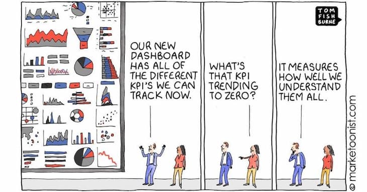
Not all of us are graphic designers. And let’s be honest: that’s a good thing! Because when we have to look at high-contrast, low-res, or poorly-coordinated dashboards, our brains turn off — which defeats the purpose of a KPI board in the first place.
Cluttered, messy, or downright ugly KPI boards are probably the number one reason for poor data adoption among frontline workers. But reader rejoice: this is a fixable problem! Most BI platforms offer ways to fix your displays, or at least update the visualizations so they’re no longer offensive to the eyes.
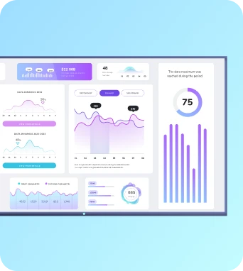
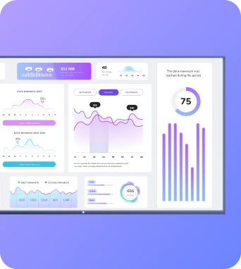
With Fugo, you can rely on a flexible design studio to create better-looking KPI boards that easily pass muster. You can also use pre-built design templates to translate your KPIs into more digestible (and beautiful) displays. Feel free to pick your favorite design from our lineup — from progress trackers to bar charts — so you can get the best possible look from your company KPI boards.
2. Missing Context For KPIs
It can be tough to get all your KPIs on the same business intelligence platform. And while buying another platform is sometimes the best option for your situation, it’s also a more frustrating and expensive option as well. Your teams may struggle to figure out what data applies to which department, or wonder how certain numbers translate into real life.
And this missing context makes data worthless to your team and the people who rely on them.
There are a few different ways to rectify a lack of context. One method is to consolidate all your data to one BI platform (which, as we know, isn’t always feasible). Another is to write lengthy descriptions of each of your KPIs — which may not be the best use of your time.
But the third and easiest option is to make sure that KPIs are reaching the right people, within the context of their daily work. This is where it comes in handy to have an apparatus for easy, democratic sharing of your key KPIs across your teams.
Most KPI & reporting platforms will have sharing options for your data - this is usually done by sending out emails, pushing them to Slack, or sharing via public URLs. These methods can get expensive fast if they require more user seats, or often go ignored (seriously - how many emails & Slack messages do you already ignore every day?)
Considering how these methods are insecure or unreliable for making sure people really track their progress against your KPIs, it will come as good news that there’s another option you probably haven’t considered - TV screens.

Organizations are turning to this medium for sharing data & KPIs given how far it lets you spread the reach of your critical numbers. TV screens actually have enormous potential as KPI communicators - all you need is a trusted TV dashboard platform to connect your KPI software to your screens.
Then, you can pick and choose different displays to cycle through the right data to drive better decision-making.
And since you can pull data from multiple dashboards, everyone on your team can get the right metrics and context — no matter which tool (or tools) you prefer to use.
3. Lack Of Real-Time Updates
Speaking of bad-looking or confusing displays, static images are probably the least-fun way to view a KPI board. They’re inactive, boring, and totally non-reflexive, which means they can’t adapt to real-time changes or showcase trends as they happen.
Static KPI boards also require manual updates, which probably isn’t something you have the time (or patience) for. Screenshotting your board and pasting the image into your digital signage tool is rarely an efficient use of your time, and could potentially lower the resolution of your final image (yikes!).
But take a deep breath: there’s a solution for this, too. Fugo updates TV dashboards in real time so you can put KPIs on autopilot for the foreseeable future. You can refresh the data once per day, once per hour, or in real-time depending on your specific needs. We also integrate directly with PowerBI and Looker so you can deploy KPI screens in just a few clicks.
4. Too Many Metrics
Some dashboard displays are downright overwhelming to look at — especially when it comes to a serious case of TMM (too many metrics). There’s so much on your KPI dashboard that it clutters up the screen, leading to analysis paralysis or unnecessary confusion for folks trying to dig into the data.
Thankfully, this is a pretty easy fix. All you need is to group your KPIs into relevant displays to create more white space for the eyes. With Fugo, you can design playlists of multiple dashboards so you can create beautiful displays without crunching everything into a single slide.
Just want to display a certain part of your KPI board? That’s no problem with Fugo. You can also capture specific sections of your dashboard to ensure everything looks clean, segmented, and seamless.
How’s that for a visual upgrade?
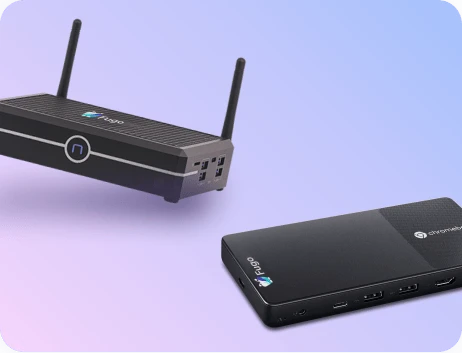
5. No Physical And Digital Display
Let’s address the elephant in the room: all-physical or all-digital teams are no longer a workplace norm. Most of us are in a gray space that falls somewhere between the two, especially with our modern remote, distributed, and hybrid workforces.
So when it comes time to display your KPI board, should you opt for a conference room TV dashboard, or expensive digital licenses?
The best solution to this dilemma is simply not making a decision at all — or more specifically, getting the best of both worlds. Fugo can help you display digital dashboards that work seamlessly on physical screens and company TV channels, which team members can view from anywhere with a WiFi connection.
And by the way, all Fugo plans come with no minimum screens so you never need to upgrade before you’re ready. We can help you distribute data to employees around the world without upgrading your BI platform or barring physical teams from key data.
Setting Up Your KPI Board With Fugo TV Dashboards
KPI boards can be a powerhouse for your business — so long as you follow the five tips above to create a beautiful display. These simple suggestions can help you maximize dashboards of any size, and avoid potential problems and pitfalls with a future-proof display of your metrics.
But key to a beautiful KPI board isn’t a graphic design degree. When you partner with Fugo to set up TV dashboards, you can hit the nail on the head every single time.
First, you sign up for a 14-day free trial to connect Fugo to all your dashboards. Then, you work on building the perfect display with premade templates, screen capture, and real-time data updates. Our company TV channel feature means you can take your dashboards on the go — even if everyone works from home (or at least in spaces outside the office).
Ready to give it a try? Just book a demo today. We’re looking forward to showing you around our platform so you can get started on a KPI dashboard right away.

