


If there’s one thing we know about the software development industry, it’s that there are lots of numbers to keep in mind. So when the time comes to set key performance indicators (KPIs), you might feel a little (okay, a lot) overwhelmed by just how much you could measure.
But the good news is, you don’t need to measure everything: just a few software KPIs that help you get a better picture of your team.
So if you’re a software development manager trying your hand at agile software development…
You can use this guide to find useful KPIs for software development that let you make helpful, accessible, data-driven decisions for your team.
First: what makes a good KPI for software development?
Good software metrics help you keep tabs on software development projects. But great software metrics help you align business objectives with project success. Now, bad KPIs for software development accomplish neither of these tasks: they might get you distracted or paint an unclear picture of your progress, process, and future needs.
"Many teams make the mistake of focusing too much on vanity metrics. Impressions, page views, and other surface-level engagement metrics may look good, but they don't tell you what's really working and what isn't. The best KPIs tell you where you are and what you should do next.”
– Robin Fussell, Marketing Manager at Draft.dev
That’s why the KPIs chosen for a software development team must do two things:
- Give insights into team performance (aka, how effectively your developers are working)
- Keep tabs on product health (aka, how stable, efficient, and user-friendly your software is).
You can use these rules of thumb to throw out metrics that don’t matter, or at least, matter a little less. For example, ‘lines of code written,’ ‘customer satisfaction,’ and ‘number of new features released’ may or may not matter to your specific development team - so they probably shouldn’t be considered one of your key software engineering KPIs.
And if they are, now is the best time to search for some new ones. 😏
So! Let’s take a look at 13 software development KPIs that meet the ‘great’ criteria for fast-moving dev teams.
13 software development KPIs for growing development teams
We selected the best software development KPIs based on the above two criteria, plus their accessibility, reliability, and usability for teams.
We also explain how to measure each metric, simple ways to resolve bad numbers, and available software (if any) that can help.
Let’s break it down by category:
Productivity and delivery
These software KPIs give you a glimpse into the overall development process, including how quickly and efficiently your team is working.
We’ll start with one of the most common below:
1. Resource allocation
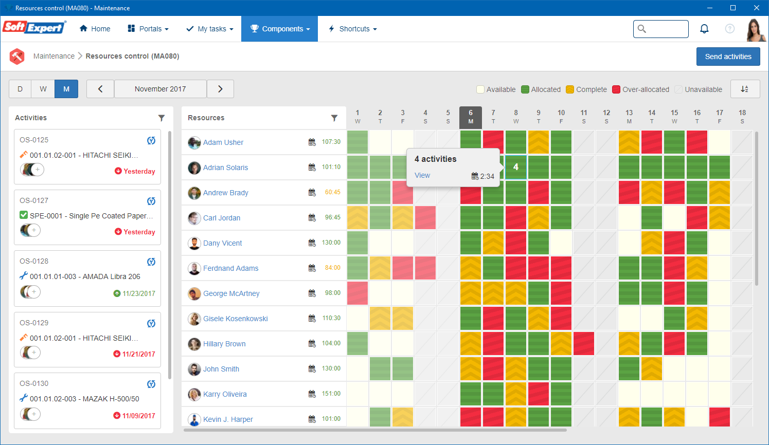
Resource allocation is a general software engineering KPI that tracks how effectively you’re using resources for your team. For example, maybe too much time is going into fixing legacy bugs while shiny new features collect dust, or maybe your senior devs are spending all day answering Slack pings instead of writing code.
Resource allocation can help you spot imbalances and help everyone on the team get more done in less time.
To measure your resource allocation, you can compare planned resources (who’s supposed to be working on what, for how long) with actual usage (where time, money, and effort really went).
You can use this equation:
(total number of billable project hours for specific task ÷ total number of available hours in specific timeframe) x 100 = resource allocation
Average resource allocation
There’s no universal benchmark here, but there should be a balance between routine maintenance and “growth” tasks, like new features and innovation.
A good way to track this is putting allocation categories on a dashboard so you can see what categories get the most time versus which categories are getting starved.
If the gap between mission-critical projects and nice-to-have tasks look more like the Grand Canyon than a crack in the sidewalk, your allocation strategy probably needs work.
How to fix bad resource allocation
Considering 50% of software projects aren’t completed on time due to misallocated resources, it quite literally pays to know where your team is spending their time.
You’ve got a couple options for addressing a low resource allocation:
- Prioritize ruthlessly. Not everything can be Priority #1, so choose your bottleneck for the week.
- Make invisible work visible. Start tracking things like meetings, support, and interruptions so they stop eating your sprint.
- Play Tetris with your team. Match the right skills to the right tasks instead of just filling slots.
2. Deployment frequency
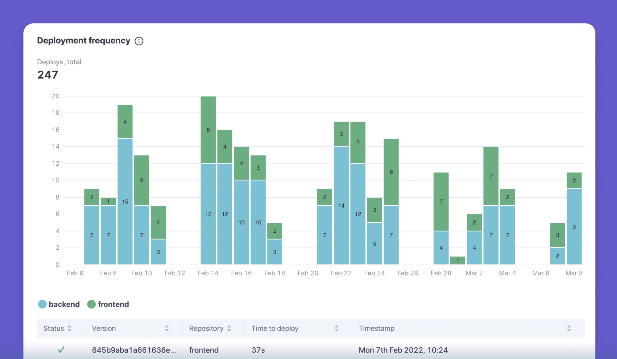
Deployment frequency is exactly what it sounds like: how often your team ships code into production. This is a direct reflection of your delivery pipeline. High frequency usually means your team has tight feedback loops, while low frequency might mean your code spends too long sitting in staging.
To measure deployment frequency, count the number of deployments to production in a given time frame (day, week, or month).
This formula looks like:
Total deployments per time period ÷ total days in time period = deployment frequency
Let’s say your team ships 20 times in October, which has 31 days. In that case, your deployment frequency is 20 times per month, or 0.65 deployments per day.
Average deployment frequency
Elite teams, or high-performing DevOps shops, typically deploy multiple times per day. More traditional teams might release weekly or monthly. Anything less than one deployment per month is considered fair to low.
Keep in mind there’s really no single ‘perfect’ number — it all depends on your business model. For example, banking software probably shouldn’t deploy ten times a day, but a SaaS app might want to.
You can benchmark your development frequency more effectively using the Dora QuickCheck here.
How to fix bad deployment frequency
First, see how many unnecessary tasks you can automate. CI/CD pipelines are your best friend in the software delivery process.
Next, see if you can’t break down big changes into smaller, shippable chunks. This can help you build more confidence, especially when paired with feature flags and rollback plans.
3. Sprint burndown
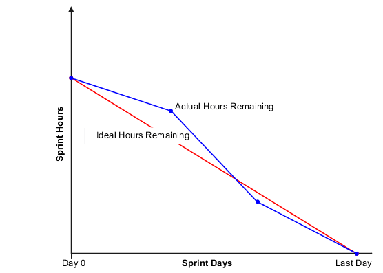
Sprint burndown helps with tracking progress for completed versus remaining work. It can also give your team a reality check. If your numbers are trending downward, it means work is getting finished at a healthy pace. But if it flatlines or spikes, something might be blocking progress, or its scope got changed mid-sprint (you know who you are). 👀
You need three formulas to calculate this:
Planned hours for sprint - actual reporting hours for sprint = actual hours remaining
Planned hours for sprint - ideal hours consumed for sprint = ideal hours remaining
This leaves you with a final equation:
Actual hours remaining - ideal hours remaining = sprint burndown
You want both numbers to be relatively close, ideally with actual hours at or below ideal hours, to show you’re making progress.
That’s why many dev teams like to create sprint burndown charts to have visual scoreboards showing how much is left versus how much has been completed.
P.S., you can also use the sprint burndown formula to calculate release burndown, which is essentially finished versus pending work for new releases. This allows you to release burndown charts that help you track where you’re at and how much time remains for your team. Same idea, different flavor. 🍨
Average sprint burndown
There isn’t much of a standard curve, since every team’s workload is a little bit different. But you should be looking for a consistent downward trend rather than a cliff dive at the end or a very, very long overextension.
Sidenote: burndown charts are usually auto-generated in tools like Jira, Trello, or Azure DevOps. So if you don’t feel like calculating numbers on your own, you can leave it to the experts to run them for you.
How to fix bad sprint burndown
Start by breaking down larger tasks into smaller pieces. Not only will this make project length easier to estimate, but it also might help your team make more consistent progress.
Another option is holding short daily check-ins to spot bottlenecks before they pile up. This is also a good opportunity to have candid conversations about scope creep. Adding surprise work mid-sprint makes charts useless, after all.
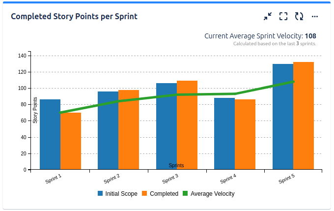
4. Development velocity
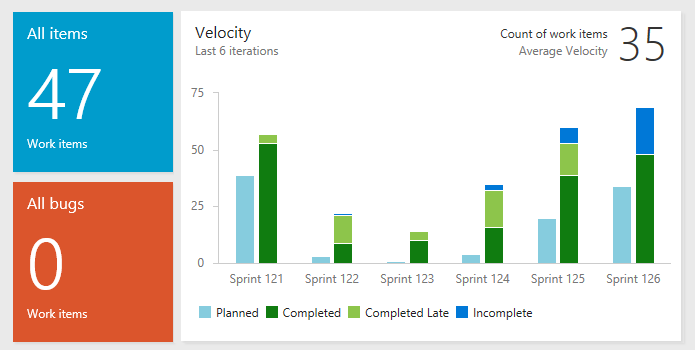
Development velocity is a way to measure how much work your team can get done during a sprint. In other words: how fast are you actually moving? Unlike deployment speed, which looks at the end-to-end process, velocity cares more about what you’re doing right now. It’s a great way to forecast what your team can realistically handle in the future and avoid 2 AM crunch times down the road.
To calculate your velocity, add up all the story points (we’ll cover these later) completed in a sprint. You can average several sprints together to get a clearer picture of what’s “normal.”
Let’s say your team closes out 25 story points in two sprints, 10 in another, and five for three other sprints. That means your average development velocity is around 12.5.
Average development velocity
Most teams have a velocity of five to 15 story points per sprint depending on their size, experience, and the complexity of work.
But don’t get too hung up on comparison here. Remember: velocity should really be a baseline for your team, and not a leaderboard against other dev shops.
How to fix bad velocity
If your velocity is all over the place, your story points might be too big or too vague. We’ve said it before, and we’ll say it again: breaking down larger projects can help you create much more accurate depictions of speed.
You can also use techniques like planning poker or retrospectives to make sure the team agrees on story point estimates. But the key here is reviewing historical velocity data to set realistic expectations for future sprints. 😉
5. Cycle time
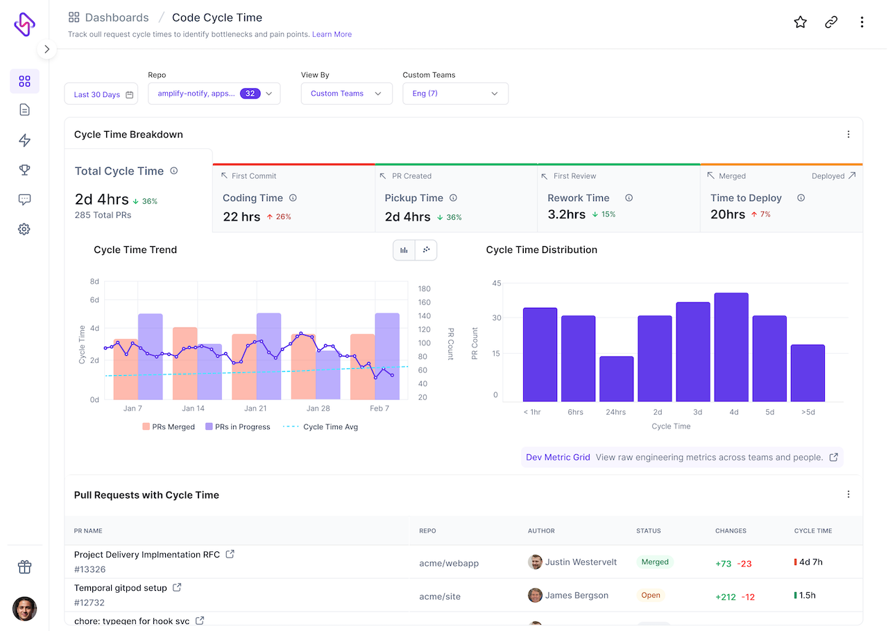
Cycle time is a favorite of engineering leaders, as it shows the time it takes for a task to go from start to finish. Think of it like timing your team on a relay race: from the moment someone grabs the baton (starts a task) until it crosses the finish line (is done and deployed).
Shorter cycle times usually mean a smoother workflow and faster delivery, while longer cycle times can point to bottlenecks, blockers, or tasks too big to handle in one go.
You can calculate cycle time with the following equation:
Task completion date - task start date = Cycle time
For example, if someone on your team spots a bug on Monday, then fixes it by Thursday, that’s a cycle time of three days. Now, you can track this number across multiple tasks or sprints to get a better idea of your team’s average speed.
Average cycle time
For most developers, average cycle time is around seven days. But the top 25% of teams are much faster than that: around 1.8 days on average.
How to fix bad cycle time
Apart from the regular suggestions (i.e., breaking down tasks and identifying bottlenecks), you might want to consider automating repetitive steps.
Research shows adopting new tooling can slash cycle times by as much as 43%. So depending on your tech stack, this could be a workflow of 4.6 hours down to 2.7 hours.
Code quality and code stability
Code quality and stability KPIs help you develop clean, efficient code for your team.
Let's take a peek at three key KPIs:
6. Test pass rate
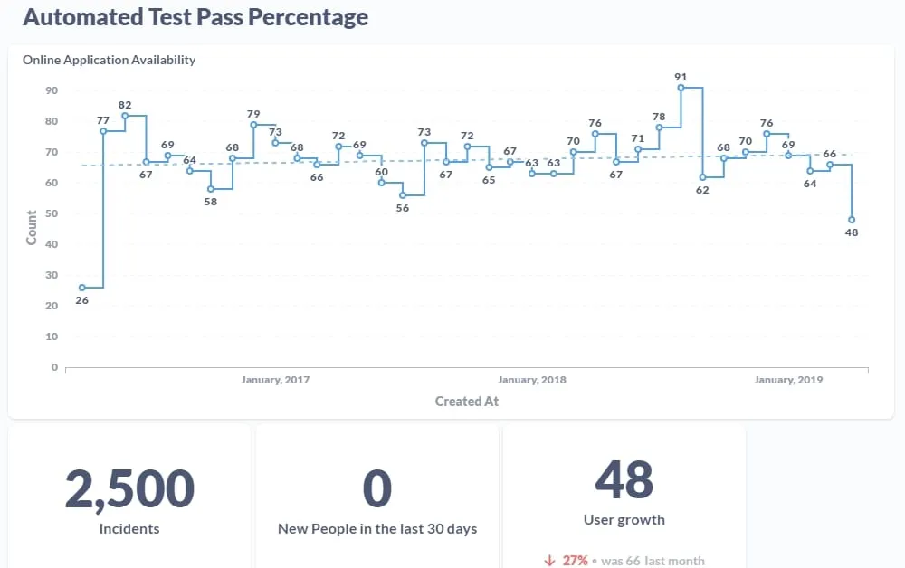
Unlike code coverage, which looks at the percent of code that gets tested, test pass rate tracks the ratio of passed test cases to total test cases run — either by automation or your software testing team. It’s particularly helpful in test-driven development cycles, since you’re avoiding unwanted side effects like shipping broken features.
Consistently high test pass rates are a good thing, since they mean your code is stable and your tests are reliable. But if your pass rate dips, you should look a little closer. Maybe you introduced regressions, or your tests are flaky, or you’re testing a bit too broadly.
You can calculate your own test pass rate with the following equation:
(Number of passed tests ÷ total number of tests executed) × 100 = test pass rate
So if you run 1,000 tests and 900 of them pass muster, your test pass rate will be 90%.
Average test pass rate
Healthy teams usually aim for a 90% to 95% pass rate. Anything less, and you might have quality issues or unreliable tests.
Note that a perfect 100% pass rate isn’t always realistic, either. Some failing tests are acceptable during development.
Even then, automated tests aren’t 100% perfect — which we touch on in the section below.
How to fix bad test pass rates
The first option here is going back to the basics. Are there software developers on your team struggling with source code stability or efficiency? Mentorship is incredibly helpful for creating a culture of quality code, especially when it’s used for training and accountability rather than punitive action.
You also have to consider the quality of your tests. In the words of Geoff Rich: “Best case, the code behind your never-failing test is doing what it's supposed to do. But worst case, the code you wrote is secretly broken.”
Be sure to regularly audit your automated tests so you can see whether you’re getting accurate reports or just another false alarm.
7. Refactor rate
Refactor rate measures how often your team revisits existing code (i.e., legacy LOCs more than three weeks old) rather than creating new code. It’s basically a measure of how often you clean your codebase. How often are you revamping old source code executes versus writing new lines?
Your refactoring rate can mean many things at once. On one hand, it shows if you’re actively keeping technical debt under control. But it could also mean you’re letting messy code pile up. And constant refactoring without shipping new features could mean you’re getting distracted with polishing when you should be delivering new features. 👀
There’s no single universal formula for calculating refactor rate, but one common approach is:
(Number of refactored lines of code ÷ total lines of code changed in a given period) × 100 = Refactor rate
So if you refactor 300 lines of code out of 1,000 total lines changed, your refactor rate would be 30% (yikes).
Average refactor rate
A ‘decent’ refactor rate typically falls between 10% and 20%. Anything significantly lower could mean you’re accumulating technical debt, and anything drastically higher might suggest you’re over-optimizing.
How to fix bad refactor rates
Again, a ‘bad’ refactor rate is heavily dependent on your team’s size, industry, and goal. If you’re managing a relatively mature software system, it might make sense to have a higher rate. But if you’re building a new product and looking to boost customer satisfaction, you probably want to see some lower numbers.
Some rules of thumb if you’re not where you want to be:
- Bake smaller refactors into your regular development cycles so you don’t have to deal with a bigger chunk in the future.
- Use static analysis tools like Python or SQL to flag messy, duplicate, or overly complex code.
- Prioritize refactoring for performance, security, or developer productivity before other bells and whistles (especially if they don’t matter to your business objectives).
8. Change failure rate
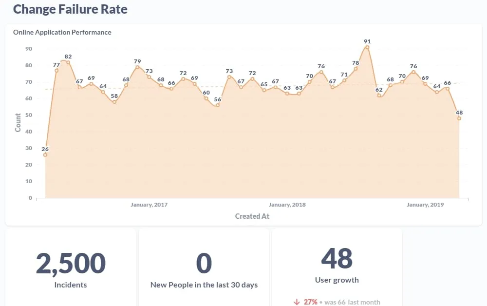
Last but not least is change failure rate, which is a measure of your software quality based on the percentage of deployments that need changes. It’s also one of the four DORA metrics, meaning it’s usually one of the stable software engineering KPIs.
A low change failure rate means your testing, pipelines, and review processes are doing their jobs. A high one could signal that your team is spending more time putting out fires than building new features.
To calculate this, use the following formula:
(Failed deployments ÷ total deployments) × 100 = Change failure rate
Let’s say your team shipped 40 updates last quarter, and eight of them went sideways and required extra work. That would mean your change failure rate is 20%.
Which, as you’ll see below, isn’t something to aspire to.
Average change failure rate
DORA suggests that high-performing teams should see change failure rates between 0% and 15%. Average teams land somewhere around 20% to 30%.
Anything higher than that, and you might want more code coverage.
How to fix bad change failure rates
It’s not if, it’s when, your code decides to fail. The trick is making sure it happens (and hurts) less often.
You can do this by:
- Strengthening your automated test suites to catch bugs before production. Although as mentioned earlier, you can’t count on automated tests alone.
- Using feature flags and rollbacks so inefficient changes don’t take everything down with them.
- Focusing on smaller, frequent deployments instead of all-or-nothing updates.
Team collaboration
These KPIs can track your team’s performance by helping you keep tabs on the development process, spot struggling team members, and otherwise identify bottlenecks slowing them down.
Let’s take a closer look:
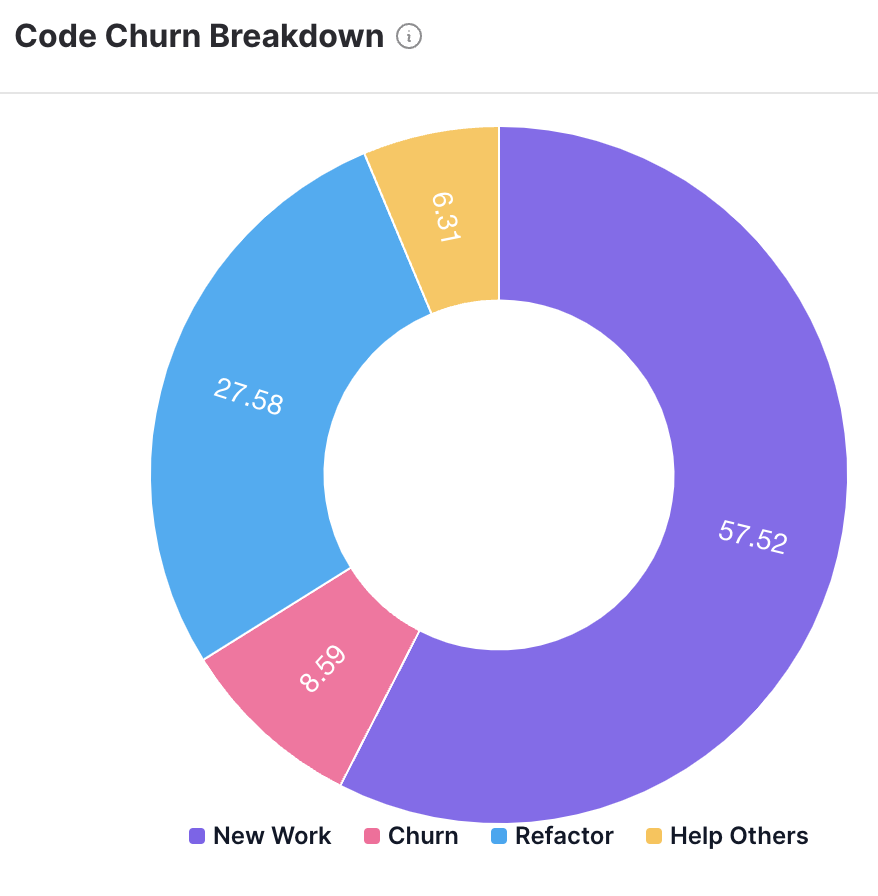
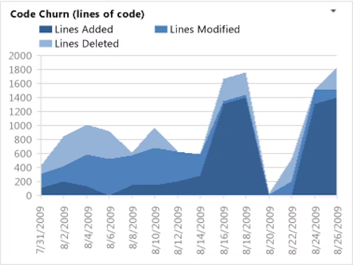
9. Code churn
Code churn measures how often code gets changed, deleted, or rewritten after its initial commit. It’s also one of the best KPIs to track the quality of your code. How much code works well with your software project versus how much needs to get scrapped or reworked?
Now, a little churn is normal (and even healthy) in most software development projects. But a lot in a short period of time is usually a red flag. It might mean there are unclear requirements, unrealistic initial planning, or bottlenecks keeping team members stuck in endless rewrite cycles. High churn also hurts morale — nobody likes spending hours on code only to throw it away.
To calculate code churn, compare the number of lines of code added, modified, or deleted to the total lines of code committed. The formula is:
(Lines of code modified or deleted) ÷ (total lines of code) x 100
For example, if you commit 1,000 lines of code and 300 of those lines are later rewritten, that’s a 30% code churn rate.
Average code churn
There’s no universal “good churn” number, but most teams aim for under 25% in a given sprint or release cycle. Anything lower than 15% shows you’re doing a phenomenal job. Anything higher than 25%, and you might want to revisit your planning process.
How to fix bad code churn
There are three ways to address the root cause of high code churn.
First, look at your requirements. Are they clear before coding starts? Is your team aligned on design decisions? You might also want to encourage peer reviews or design discussions before bigger commits.
Second, think about creating a style or review guide. This is a great first self-help guide toward supporting your team’s development efforts.
Third, consider gamifying your code quality to create a culture of excellence. You might create dashboards showing which team members create the highest-quality code, or which team members spot the greatest number of mistakes. With Fugo, you can easily create leaderboard dashboards that help engage your development team and boost team productivity.
💡Related: Employee Gamification Examples & Ideas for Digital Signage
10. Code coverage
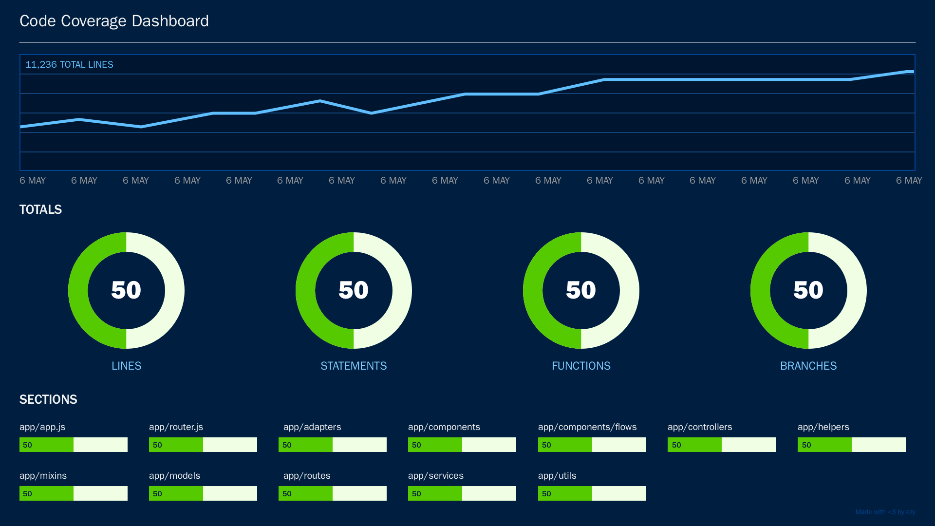
Code coverage measures what percentage of your code changes are reviewed before merging. This lets you easily determine how much of the code that makes it into production has actually had another set of eyes on it.
This is important because unreviewed code is a recipe for bugs and security risks, not to mention a whole lot of technical debt. High code review coverage tends to mean higher-quality code, fewer surprises in production, and more shared knowledge across your team.
To calculate code review coverage, divide the number of code changes that go through review by the total number of code changes made. It should look something like this:
(Lines of code executed) ÷ (total lines of code) x 100 = code review coverage
If 80 out of 100 commits are reviewed before merging, that’s 80% code review coverage.
Average code review coverage
Studies show that most software development teams achieve somewhere around 74% to 76% code review coverage. Of course, the closer to 100% you can get, the better. Realistically, though, this number gets harder to achieve the more lines of code you have.
How to fix bad code review coverage
The first and easiest solution is setting clearer expectations about reviews. It helps when you standardize the process: when should code be reviewed, by whom, and within what time frame?
You should also make thorough code reviews easier (read: less dreaded) by encouraging smaller commits. Nobody likes wading through a monster PR, and reviewers are much more likely to give thorough, thoughtful feedback on smaller chunks of code.
11. Pull request (PR) development cycle time
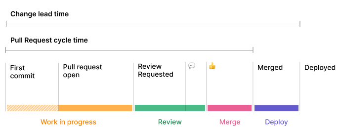
PR development cycle time measures how long it takes for a pull request (PR) to go from submission to merge. In other words: how fast can your developers get code reviewed, approved, and into production?
The clock starts the moment a developer submits a PR, and it only stops once that PR is merged into the main branch. Shorter cycle times usually mean smooth collaboration and efficient reviews. Long ones, on the other hand, are a sign of serious bottlenecks.
Here’s the quick and dirty calculation:
Pull request time - first commit time = Pull request (PR) development cycle time
Average PR cycle time
There’s no hard-and-fast number, but many high-performing teams aim for 58 hours to 124 hours from submission to merge. Anything longer, and you risk developers losing context on their work.
How to fix bad PR cycle times
If your PR cycle time feels more like PR cycle forever, you might want to consider setting review SLAs. You might also encourage smaller PRs. 1,000-line pull requests are scarier than 500-line PRs, after all.
Another secret weapon is diagnosing your bottlenecks. Once you find the step (or person) that needs extra support, you can look for ways to streamline work and automate where necessary. That way, there’s less on your plate for humans to manage, and more time for humans to ship code instead.
12. Story points
A sprint and story point measures the relative effort or complexity of a task during a sprint. In less jargony language, that means you’re deciding how hard something is so you can estimate task times for your software development team.
Now, story points don’t technically reflect actual time spent on something — they’re just an abstract unit that helps teams compare tasks against each other. For example, fixing a minor bug might be just one story point, but building a new feature might take five points or more. And then you have to factor in risk: if you’re working on a project with an intern, for example, it might take longer and be more risky due to their inexperience.
Now, there’s no single formula for story points, since each team assigns values based on context. However, many teams use the Fibonacci sequence (1, 2, 3, 5, 8, 13, etc.) to layer tasks and create working ‘formulas.’
For example:
- Trivial software tasks might be one point or less
- More complex software development projects might require three points or more
- Large, high complexity, multi-day or multi-person efforts could take eight points or more depending on your team
So if a project requires multiple tasks, you just add up the story points to get a better idea of complexity and effort.
Software developers can use these story points to determine velocity, or the total number of story points they can complete in one sprint. That way, you can estimate their max capacity and forecast future efforts — and possibly eliminate some working weekends, too. 😏
Average story points per sprint
Research shows a typical Agile team can finish four to 20 story points per sprint. That said, this number should vary based on the size of your team, their level of experience, and how your business defines ‘points.’
How to fix bad story point estimation
If your team is consistently missing estimates, or if their velocity is wildly unpredictable, you may need to break down oversized stories into smaller ones. You might also try something like planning poker or monthly team discussions so you all agree on story point values.
For the best possible estimate, review historical data. This lets you compare past estimates to actual outcomes to re-calibrate your numbers.
13. Flow efficiency
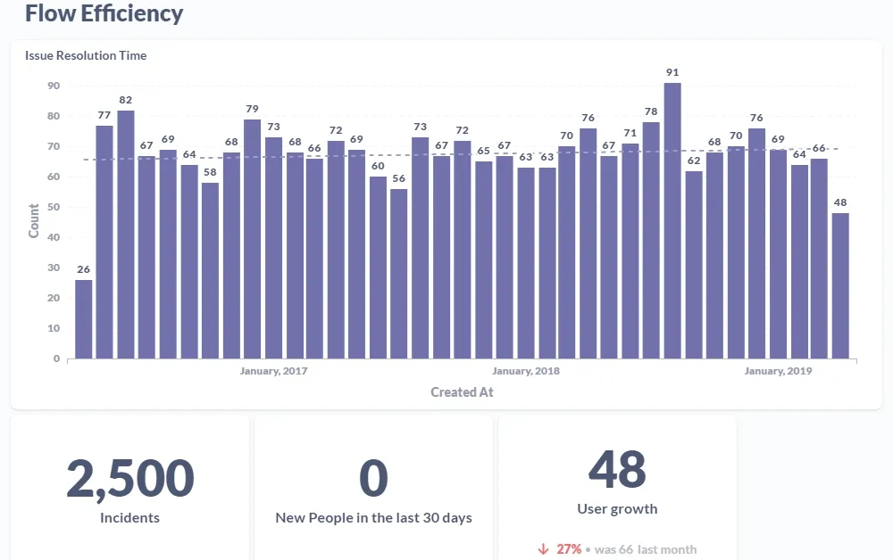
Flow efficiency determines the percent of progress your software engineers are making on a sprint. This can help you determine what’s getting in between your developers’ ‘flow states’ and inhibiting an otherwise speedy workflow.
You can measure flow efficiency by dividing your total lead time (aka time spent working on something) by your active work time (aka, time that’s not spent waiting on a particular task). For example, let’s say you spent three hours coding, but only two hours of that were actively spent typing.
Your equation would be:
Work time ÷ (work time + wait time) x 100 = flow efficiency percentage
Calculating out our specific example, you would have a 66% flow efficiency score.
Average flow efficiency
The average speed for flow efficiency is anything from 15% to 40% of active work.
This means out of your typical four-hour workflow, you should only expect to complete 36 minutes to 96 minutes of active work.
How to fix bad flow efficiency
If your task flow efficiency is below 40% (or worse, below 15%), try taking inventory of your project workflows.
Are there unnecessary wait times? Which ones have the biggest impact? If you don’t know for sure, you might try creating a visual diagram of each one and its effect.
This will give you the chance to start designing experiments that can help you slash long lead times and get happier customers in the meantime.
KPI overload: common pitfalls to avoid
Now that we’ve talked about the dos of a great KPI, let’s look closer at the don’ts.
The first and most important is not adding everything and anything. Yes, it’s tempting to adopt vanity metrics and good-looking numbers. But does that net promoter score actually ensure project success?
Don’t let yourself get distracted by ‘shiny object’ syndrome if there are other (more important) key performance indicators to keep in mind.
Another common issue is the KPI board itself. We’ve all suffered from ‘KPI-itis’ before — wanting to add as many metrics as possible to the same development board. Unfortunately, this usually results in messy-looking displays that have too many charts and not enough context.
We cover this in greater detail in our guide to common KPI board mistakes.
Now, there are many ways to fix this, but the easiest is picking a great KPI dashboard provider. Providers like Fugo offer all sorts of features to bring your display boards to life, including AI tools that take the stress off designing a picture-perfect KPI board. 👏
How smart teams are setting software development KPIs
It’s one thing to choose KPIs for software development, but another thing entire entirely to put them into practice. The good news is, you don’t need to set the limits yourself. With tools like Fugo by your side, it’s easier than ever to define, surface, and adjust KPIs to keep everyone on your team in the loop.
Fugo can help you:
- Keep business goals front and center with digital signage displayed on your browser, conference room TVs, company intranets, and more
- Create prompt-based dashboards with release burndown charts, development velocity trackers, and more — all using KPIs without traditional spreadsheets
- Make decisions about business goals and strategic objectives by tracking successful project completions and forecasting future tasks.
We can’t say too much for now, but we can reveal there are lots of goodies on the horizon.
And if you’re interested in being one of the first to check it out, you can sign up today for Fugo’s AI beta program.
Frequently asked questions about software development KPIs
Q: What is a KPI in software development?
In software engineering, KPI stands for key performance indicator, which is a measurable metric that helps teams track if they’re meeting their goals. KPIs like cycle time, velocity, and defect density, for example, help reveal how well a team is delivering quality code on time. The goal is giving teams more objective data to guide decisions, improve processes, and prove the value of their work to stakeholders.
Q: What are the 4 P's of KPIs?
The four ‘P’s help you look at KPIs through four specific lenses: Purpose, Progress, Performance, and Prediction. This means every KPI you adopt should have a distinct purpose and map out part of the software development process. It should also speak directly to your team’s performance and help you avoid software failures and optimize future projects.
Q: What is a KPI in SDLC?
In a Software Development Life Cycle (or SDLC), a KPI is a metric tied to specific phases of development. In planning, for example, lead time for requirements can be a KPI. Code quality metrics like code churn or coverage may be more important for development workflows.
Q: What are good KPIs for the IT department?
Strong IT KPIs should measure impact on business continuity, security, and user satisfaction. This includes key performance indicators like:
- System uptime, or reliability of infrastructure
- Incident response time, or how quickly IT resolves problems
- First call resolution rate, or the effectiveness of support teams
- IT spend versus budget, or cost control
- User satisfaction scores, or feedback on IT service quality

