


Well, this is it. Spreadsheets had a good run. They walked so modern dashboards could run — and now, they’re sitting down. Permanently.
Sure, they helped us track budgets and churn, and pretend we knew how to use pivot tables and Macros.
But in an age of AI (and expensive view-only licenses in BI tools), spreadsheets are dated relics compared to the new heirs to the throne: AI dashboard builders.
AI data dashboards don’t need complex SQL databases, won’t break when you sneeze on a formula, and don’t require your VP of Ops to give a 30-minute TED Talk. They also make dashboard creation a snap so you can show off key metrics and other valuable insights in even less time.
Let’s take a deep-dive into AI-generated dashboards so you can learn how they work, why they matter, and how to build some of your own. 😏
Spreadsheets and BI: once the gold standard, now a bottleneck
Dedicated business intelligence tools got us far, and spreadsheets still have a place in certain contexts and workflows. But if you look a little closer at traditional data visualization tools, you’ll see they no longer fit the speed of modern work.
Here’s why:
Building formulas
Scrolling through a spreadsheet at 11 PM to find one broken formula is a special kind of despair. All it takes is a single person deleting a cell, pasting incorrect data, or misplacing a parenthesis by bumping the keyboard with their elbow.
Suddenly your beautiful dashboard becomes a sad, error-riddled wasteland. Better hope you had version history turned on! 🙃
TL;DR: modern teams like yours don’t have time to babysit formulas. We all just want dashboard tools that function without syntax wizardry required, which is where AI comes in (more on this later).
Macros
If you just threw up a little in your mouth, I get it. I really do.
And look, macros do have pretty interesting uses… if you know how to write and debug them, if you’ve documented everything, and if no one ever touches the dashboard sheet except you.
For the rest of us mere mortals, they’re a time bomb just waiting to happen. It’s when, not if, they decide to act up.
So wouldn’t it be nice to have AI dashboards that replace all that with logic you stuff you see, tweak, and actually explain?! 😉
Security risks
So maybe you use(d) spreadsheets because they keep your data safe. You needed secure sharing and couldn’t let visualizations fall into the wrong hands, so you stored them away in an on-premise solution to keep them locked out of the public eye.
Except on-prem solutions aren’t necessarily a failsafe against bad actors, curious teenagers, and other ill-intentioned users. Depending on your setup, they might be clunky to update, easy to misconfigure, and prone to human error (read: funky email attachments and lost USB sticks).
Some cloud-based AI dashboard generators offer granular permissions and encrypted access to help prevent security risks from slipping through the cracks. Plus, they don’t rely on someone remembering to remove ‘Temp-Final-v4’ from the shared drive.
Real-time collaboration
So spreadsheets and BI tools technically do offer real-time collaboration. It’s just not necessarily all that robust.
Ever tried working on a shared file during a meeting while three other people try editing the same cell? Or adjusting chart types at the same time as your co-workers?
Absolute chaos.
If only there was a better way to collaborate that doesn’t feel like you’re railroading the Anonymous Aardvark on your Spreadsheet. 🐨
What’s changed: The rise of AI dashboard builders
You don’t need to be a rocket scientist to see it: traditional dashboards and spreadsheet systems aren’t keeping up with the pace of modern work.
That’s because what spreadsheets were to paper, AI dashboard builders are to spreadsheets. And they’re totally changing the game for growing businesses.
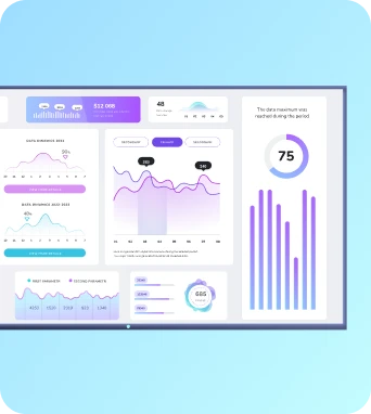
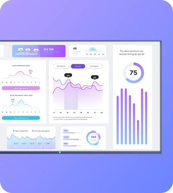
Instead of manually configuring charts, adjusting filters, and begging VLOOKUP to cooperate, you can let AI build dashboards just by asking for what you want. You can type in your idea or speak it out in a voice note, and voila! You’ll have branded, data-ready content for your screens.

The magic of AI dashboards is mostly speed. There’s none of the technical friction or confusion of traditional BI platforms, which lets you focus on making data-driven decisions without the mess of traditional BI platforms.
Plus, your teams can get much-needed insights even faster. You don’t have to worry about your data sitting untouched because no one wants to be the one to “accidentally break the dashboard again.”
But we might be getting a little ahead of ourselves.
First, let’s take a look at whether your business is ready for the shift.
5 signs you’re outgrowing traditional tools
Yes, spreadsheets, BI, and Google analytics can help you with the basics. But they aren’t always enough to get the actionable insights you’re looking for.
And the good news is, there are plenty of AI models to take their place.
Here are a few signs it’s time to upgrade to AI-powered dashboards instead:
1. It takes hours to get one visual
Whether you’re using Google Sheets, Power BI, or something similar, it shouldn’t take that much time to put together at least a simple visual. But if you find yourself spending your entire afternoon wrestling with filters, formats, and broken formulas... you’ve officially outgrown the traditional approach.
Dashboard AI programs, on the other hand, can get to work in literal minutes. That way, you get a finished product within the time it takes to brew a cup of tea (or less).
All you need to do is worry about your data sources: AI can build dashboards and bar charts on your behalf.
2. You rely on devs or data teams
Have to ping your BI developers just to generate charts? Or beg your data analysts to run SQL queries on your behalf?
AI-powered dashboard generators can help you turn data points into interactive visualizations in just a couple of keystrokes. Just add your raw data or upload a CSV file, prompt the AI chat (or select a pre-built template), then let the AI create a new dashboard with insight explanations, actionable insights, and more.
3. Updating reports weekly is manual
Manually compiling reports? Or forced to create dashboard wireframes? Painful, truly. And time-consuming to boot.
Studies show employees can spend up to 3.7 hours per week compiling data from multiple sources. If you’re an employee, that’s almost 45 minutes per day. If you’re an employer, that’s a whole lot of money going towards a task that’s easily updated with AI-powered dashboards.
With dashboard AI, you can easily generate, edit, and update dashboard components, saving time and effort to spend on other tasks (like cleaning raw data).
4. Stakeholders never use the dashboards
So maybe you don’t actually mind putting in the time. Maybe complex queries and manually designed dashboard components don’t actually bother you and your team.
But what might actually bother you is the sheet volume of unused data visualizations just sitting around in your business intelligence tools. You might have an extensive library of dashboard designs and valuable information, but they never get used because:
- They’re locked in complicated setups. As in, they’re difficult to access in a self-hosted solution, or you need to understand SQL to ask questions. In the words of a sage internet celebrity, “ain’t nobody got time for that.”
- There’s no automatic explanation function (aka natural language queries). Dashboard analysts either have to flag down a data analyst in your company, or learn how to find answers across
- There are no interactive elements available for users. There’s no way to mouse over charts to get hard numbers or interact with the screen to drill down into other insights.
5. You have a graveyard of half-finished dashboards
…oops.
And look, we’re all guilty of this. But if it’s a pattern rather than a fluke, it might signal a deeper problem.
Because working with complex tools like Power BI (or over-simplistic tools like Google Sheets) might make it difficult to complete your data visualization exactly how you’d like it.
AI dashboard generators, of course, are a much simpler answer to the problem. Just pop in your numbers, let the dashboard generator run, and distribute finished reports to everyone on your team.
How AI dashboards flip the script
So what makes AI dashboard generators so much better than traditional tools?
Because they’re 100% prompt based and designed around speed. They do away with the manual process of building dashboard wireframes and painstaking charts, and instead use natural language to help you build the data visualization you wanted from the beginning.
Traditional dashboards usually come with a checklist of chores:
- Choosing a data source
- Cleaning the data
- Consulting with
- Building a chart
- Tweaking the formatting
- Adjusting for various screen sizes
- Realizing you used the wrong chart type and starting over
AI dashboards, on the other hand, flip that entire process on its head. Instead of clicking through 47 dropdown menus or googling “how to make a waterfall chart in Google Sheets,” you just tell the dashboard what you want in plain ol’ English.
Now, you should know most public-facing AI tools like ChatGPT or Claude can’t do this just yet. They’ll talk about dashboards, maybe even tell you how to build one or give you code, but they’re not actually able to build it for you.
You’ll instead need a dedicated AI dashboard tool that can integrate directly with your data stack.
That way, you’ll be able to:
Summarize dashboards in seconds
You can use natural language queries like “what does our business performance look like for Q2” to get key insights summarized in a few seconds or less. That way, everyone in your business (from the intern to the product manager) can get automatic insights in a way they can understand.
It sure beats sending confused emails to whoever (you hope) has answers, then waiting multiple days to receive a reply.
Make cute dashboard designs, without the design expertise
In the past, it might have been stressful for your team to design dashboards that weren’t, eh, unique looking. Thankfully, AI-powered dashboards make it incredibly easy to build great-looking dashboards with interactive elements, custom integrations, on-brand colors, and more.
Need to make some adjustments? Swoop in yourself to apply filters, update colors schemes, or change screen sizes. Alternatively, just switch on your mic and tell AI to edit dashboards on your behalf.
And speaking of interactivity…
Build interactive dashboards based on triggers
Interactive can mean a whole lot of things besides touchscreens — although with Fugo, you can set those up, too.
‘Interactive’ can also mean creating trigger-based workflows that instantly populate images on your screen.
For example, let’s say you create a sales leaderboard dashboard that displays highest performing reps and their most recent deals. You can set up an interactive, AI-powered workflow that instantly detects when a team member closes a new sale (like updated info in your CRM, perhaps), then pushes data to your screen so everyone on the team can celebrate.
Compile all your data from multiple sources
Tired of cherry-picking data from a slew of data sources? With dashboard AI, you can compile everything into a single dashboard. It should be relatively simple to grab an API key, then create seamless integrations with:
- Power BI
- Cloud-hosted CSV files
- Google Ads
- Google analytics
- E-commerce platforms
- SQL databases
- And more data integrations
What this means for teams in 2025
You don’t have time to waste on dashboards that take hours to build and even longer to explain. What you really need are tools that are reactive, contextual, and fast, and can help you get genuine insights without dragging your devs into every conversation.
You can see AI dashboard builders are making it possible to move faster, think clearer, and spend more time acting on data instead of wrangling it. Rest assured we at Fugo.ai are taking notice — and maybe putting together some surprises of our own. 🎁
Sign up today for the Fugo AI Beta Program and join the new era of AI dashboard builders for digital signage.
Frequently asked questions about AI dashboard builders
Q: How to create a dashboard in AI?
First, sign up for a Fugo account (free for 14 days). Then, register for our AI beta program to start testing features like trigger-based automations, prompt-to-slide AI flows, smart content generation, and more.
Q: Can ChatGPT create dashboards?
No, unfortunately. ChatGPT can help you create code for dashboards, or generate data in a table or visualized chart. But it’s currently not strong enough to generate entire dashboards or push them to your digital signage screen.
Q: Can AI create an Excel dashboard?
Excel only offers two AI dashboard features: Ideas, which gives you suggestions on how to visualize your data, and AI-driven data types, which let you convert plain text to specific data types if they’re public-facing data (like stock values, for example). But you should know you can’t use Excel AI to create a full-fledged dashboard.
Q: Can Copilot create a dashboard?
Yes, you can make some rudimentary dashboards with Copilot, but you’ll need to purchase some prerequisites first. For example, you’ll need a paid Microsoft workspace that comes with Microsoft Fabric. You’ll also need write access to either a KQL queryset or features like Real-Time Dashboard, which can be relatively expensive depending on your plan.

