For most of human history, running a successful business just meant doing stuff that made money. But we live in a much more competitive world these days, so if you want to get ahead, you’re probably gonna need data.
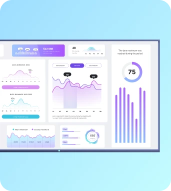
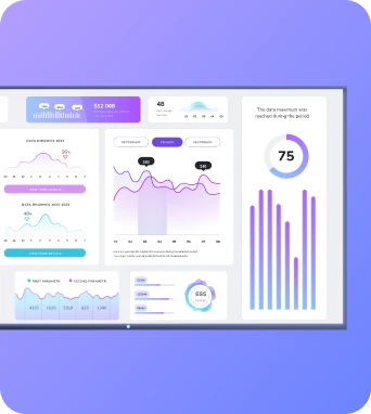
More than two in five companies now use dashboards to collect data, which can help them decide what’s working versus what’s not. But we both know dashboard creation isn’t necessarily easy — which is why the most successful businesses are upping the ante with AI.
AI-generated dashboards take business intelligence to the next level by letting you generate, connect, track, and visualize data without building anything from scratch. You’re not bottlenecked by single analysts, and you don’t need to spend hours learning technical skills. All you have to do is ask and receive, then get actionable insights and make informed decisions.
In this guide, you’ll learn why your business should be next, including all the benefits you’ll enjoy by tapping into AI dashboards.
What is an AI data dashboard?
AI dashboards are AI-powered data visualizations created by artificial intelligence. You simply instruct the AI to do something (like “help me make a new dashboard for SaaS KPIs), then sit back, relax, and let the software do the rest.
There are lots of different ways to create AI-generated dashboards, from upgraded features in traditional BI tools to standalone tools designed for dashboard creation. No matter what you pick, the outcome should be the same: an automated dashboard you don’t have to manually create or maintain.
Why your business needs need an AI dashboard tool
You probably already use dashboards, and you probably also use AI. So there’s a good chance you’re aware of the benefits of both. But you may not be familiar with how they work together..
Here’s what AI dashboards do differently from manual data products:
- Consolidate all your dashboards. Did you know a whopping 78% of companies offer dashboards in their software? This is great for collecting data, but not so great for collecting data between platforms. Thankfully, you can use AI-powered dashboards along with AI assistants to fetch data between platforms and consolidate everything into one screen. This also makes it easier to make digital signage dashboards. But don’t worry, we’ll get into more on that later.
- No template hunting. Dashboard templates have their place for sure, but they’re not always convenient (or confidence-boosting) if you don’t have much technical expertise. Because you’ll still need to update and modify your template, plus add all the bells and whistles like video tags, charts, updated datasets. The good news is that AI can make it easier by generating data visualizations with natural language processing. For example, let’s say you tell your AI you want to use specific data sources, but add interactive elements. Then, it automatically creates an interactive dashboard you can use for presentations, lobby kiosks, and other situations.
- One-click changes via prompt. Speaking of edits, AI tools can make editing infinitely simpler. Rather than manually updating metrics across dashboards, you can try using AI to make lightning-fast changes without manually fiddling with data points or charts. This means it is easy to keep your dataset clean and accurate without having to learn technical skills or carve time out of your day for edits.
- Data visualizations that can scale across teams (not just data people). Gone are the days of needing BI development teams or leaning on developers and analytics crews to generate dashboard components. With AI dashboard generators, literally anyone on your team can create data. No need to bottleneck your existing team or stress out
Okay — whew! 😅 We’ve covered most of the basics. And long story short, there’s a lot to be gained by switching to AI dashboard generators.
With this in mind, let’s take a closer look at how to use AI dashboards (including the magic you can make) in the section below.
Everything you can do with an AI dashboard generator
Who said dashboard generation had to be difficult?
Here are six things you can do with your AI-powered dashboard that traditional datasets can’t or won’t support:
1. Create AI dashboard data visualizations
Need to quickly create some visualizations for your sales team? Or put some metrics in context for a stakeholder meeting on Monday? With AI dashboard tools, you can generate models, charts, and other visualizations in seconds. All you need is a dataset (and maybe a quick once-over for accuracy).
Since some AI dashboards pull data from multiple sources, you can also generate charts and surface trends from across more than one platform. This makes it easy to consolidate data in a single location, then get everything suited up in the same model or chart.
2. Ask questions and get answers
Imagine a dashboard that doesn’t just display data, but can actually help you interpret it, too. Some AI tools come with natural language processing capabilities, meaning they can listen, respond, and offer suggestions based on trends in your data and previous interactions with the tool.
For example, if you run a SaaS company, you might ask:
- “Why did churn spike in Q2?”
- “What’s our best-performing customer segment this month?”
- “Can you compare MRR growth by region over the past 6 months?”
Then, your AI dashboard can help pull up information, suggest follow-up queries, or flag trends you didn’t think to ask about (more on this later).
In other words, your dashboard becomes less of a one-off report and more of a decision-making assistant you can query in real time.
3. Predict trends before they happen
AI dashboards work as business advisors by day, and moonlight as fortune tellers by night. Not as in a ‘palm reading’ or ‘crystal ball’ kind of way (yet), but as in helping you analyze historical data, usage behavior, and buying patterns.
For example, AI can proactively spot red flags or golden opportunities before they show up in your business. It might predict a high churn month, low profits, or poor closing rates, which can help you follow a breadcrumb trail to the root cause (like poor lead quality, for example).
You might not have the time or bandwidth to predict trends yourself, but you can still use AI to peek at what might happen next so you can act accordingly.
4. Tap into AI reporting tools
AI-powered dashboards can help you automate the entire reporting process — think pulling in data, formatting visuals, and even summarizing insights — so you can bring the bullet points to your board meeting.
You might also integrate with third-party tools and integrations to make regular reporting easier. For example, you could generate a weekly metrics digest, prep slides for your board meeting, or pull together a report without spending hours clicking through pivot tables.
Even better? AI dashboards can tailor reports by audience. That way, your CMO gets brand insights, your CFO gets forecasts, and your support team gets CSAT data without you lifting a finger (or writing a single formula).
5. Future capabilities of AI dashboards
Just like websites moved from code to no-code, AI dashboards are moving from drag-and-drop to prompt-based workflows.
We’re still in the early innings here, but there are still a few trends worth keeping an eye on.
Like:
- Auto alerts: AI dashboards might be able to notify you when something spikes, drops, or falls out of whack (or whenever it predicts that might come to pass).
- Cross-tool integrations: Your future dashboard might not just pull data from multiple sources — it might be able to summarize it, answer questions about it, and push updates to Slack, email, or a giant office screen.
- Scenario modeling: Want to know what happens if you increase ad spend by 20%? Or change your pricing model? Future dashboards will be able to run those simulations in seconds and show you projected outcomes.
- Natural language input for data cleaning: You might be able to say “remove outliers” or “group by product category” so it’s something you have to script or configure.
How to create an AI dashboard
Assuming you’re using Fugo as your digital signage companion, here’s what you’ll need for dashboard generation:
1. Sign up for a 14-day free trial of Fugo. We won’t collect any credit card information during your trial, so you don’t have to worry about getting billed before you’re ready.
2. Sign up for Fugo’s AI beta program. This will give you access to all new and upcoming AI features for free, plus discounts on future plans or access tiers moving forward.
3. Get a quick onboarding call with our team. This allows us to hear more about what you’re looking for, plus give you the low-down on our new features so you know exactly what to expect.
4. Get early access to features as soon as they're released. This includes tools like trigger-based automations, prompt-to-slide flows, smart content generation, and much more.
5. Trial each feature and let us know how it works. We’re rolling out new features incrementally (usually on a biweekly basis), and you’ll hear from our team one to two weeks after launch so you can give us honest feedback and let us know how we can improve.
And that’s it! You can start building AI dashboards in as little as a few days.
Pssst: Wondering what else Fugo can do for your digital signage? Learn more about our core features here.
Fugo: The best AI dashboard builder for digital signage
There’s no doubt AI dashboards are amazing tools for growing businesses. They’re just early in development, with lots of room to grow.
Not many AI tools have the robustness at this stage to carry out such complex data tasks. But there are a few tools making some pretty serious strides using AI — including platforms with free demos so you don’t have to pay extra for new features.
That’s what makes Fugo the best AI dashboard builder tool for small businesses wanting to explore more data-driven decision making for their brand. You can keep tabs on key business metrics, generate multiple visualization types, and otherwise condense complex data into simple, easy-to-analyze charts.
See for yourself what a dashboard generator can do by signing up to join our AI Beta Program.
Frequently asked questions about AI dashboards
Q: Which AI can make a dashboard?
Some AI tools like Notion or Microsoft Copilot can help you generate dashboards directly inside of their existing programs. Others, like Fugo AI, are purpose-built just for data visibility. Since Fugo is platform-agnostic, you can collect data across multiple platforms, then push your finished data dashboard straight to a screen, playlist, embeddable link, or Slack channel.
Q: What does AI on the dashboard mean?
Two little ‘twinkles’ or ‘stars’ on your data dashboard tool typically indicates artificial intelligence. Depending on the platform, it can help do the heavy lifting so you don’t need to worry about writing SQL or hunting down formulas.
Q: What is the dashboard of an AI model?
The dashboard of an AI model typically refers to the interface you use to interact with an AI model (think ChatGPT, Claude, Copilot, Jasper, or something similar). These dashboards provide information like current users and training data, uptime information, usage amount, and output type.
If you're building or monitoring an AI model yourself, you can use this type of dashboard to track performance, fine-tune models, and prevent outages that mess with your workflows.
Just keep in mind it’s not the same thing as an AI dashboard, which is a data dashboard made through the use of AI.
Q: What are the 4 common types of dashboards?
The classic four types of dashboards are:
- Operational dashboards: These typically offer real-time info about day-to-day tasks, like call volumes or website traffic.
- Strategic dashboards: Mostly high-level KPIs for C-suite and leadership (e.g. revenue, growth rates).
- Analytical dashboards: Your data teams or analysts can use analytical dashboards to hunt for trends, patterns, insights, and other business data that may require more context.
- Tactical dashboards: Tactical dashboards are usually for single campaigns, objectives, or goals, like mid-term campaign results or sales performance in Q4.
FYI most AI dashboard tools can generate all four, depending on your data and the data visualizations you want to see.


