

Real-time manufacturing dashboards on the shop floor
Your production data already exists. It is in Power BI, in Grafana, in a plant dashboard someone built on an internal web page. The problem is that nobody on the floor sees it, because seeing it means walking to an office and logging in.
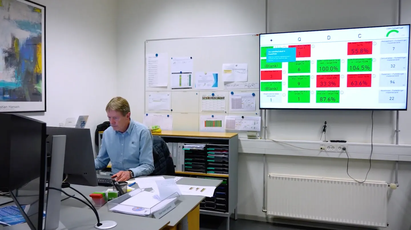
Fugo puts those dashboards on screens where the work happens. Point Fugo at the dashboard you already have, choose which screens show it, and it stays on. Operators see the shift target. Supervisors see which line is behind. Nobody stops working to go and check.
What a real-time manufacturing dashboard shows
A shop floor screen is not a report. People walk past it, so it has to be readable in two seconds from ten metres away. Fewer numbers, bigger numbers.
Production target vs actual
The single most-used shop floor number. Units produced so far this shift against the target, with the gap called out. Everything else is context for this one figure.
OEE and its three parts
Overall equipment effectiveness combines availability, performance and quality into one percentage. Show the headline OEE figure per line, then the three components underneath so it is obvious which one is dragging.
Quality, scrap and first-pass yield
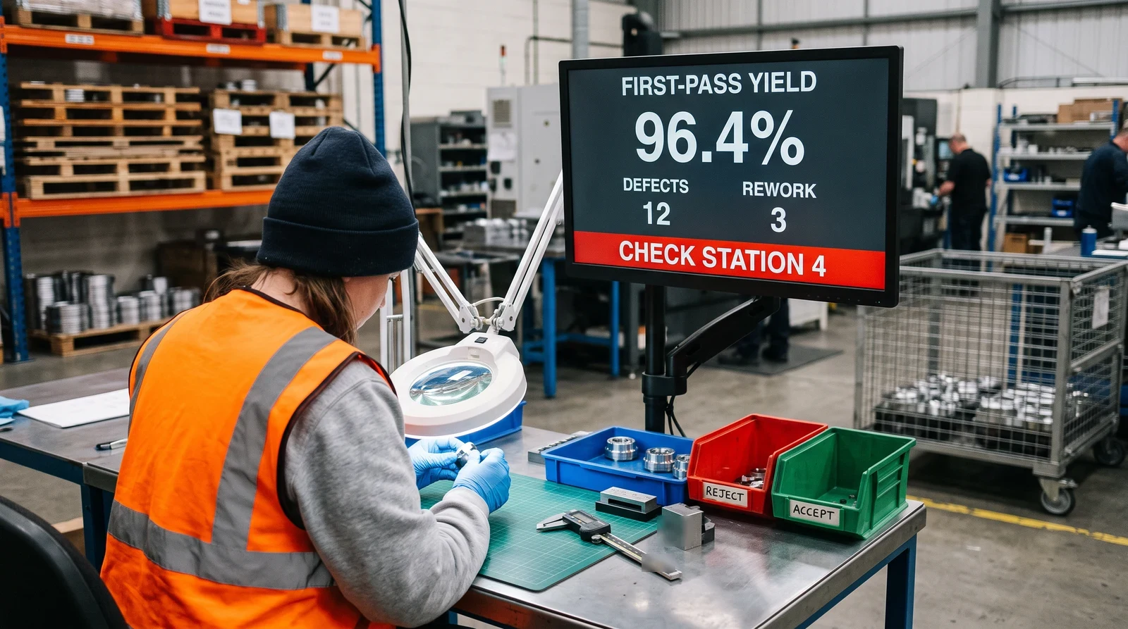
Reject counts, scrap percentage and first-pass yield, per shift or per line. Showing quality next to output stops teams optimising one at the expense of the other.
Downtime and equipment status
Which machines are running, which are stopped, and how long the current stoppage has lasted. The shortest useful shelf life of any metric, so it belongs on a screen rather than in a daily email.
Order status and backlog
Open orders, completion percentage and backlog depth, so a line knows what is coming next rather than finding out at changeover.
Shift schedule and staffing
Current crew, break times and the incoming shift. Useful on a break room screen even when the line screens show production numbers.
Safety metrics
Days since the last recordable incident, open safety actions and PPE reminders. Many plants run these on the same screens as production data, switching between them on a schedule.
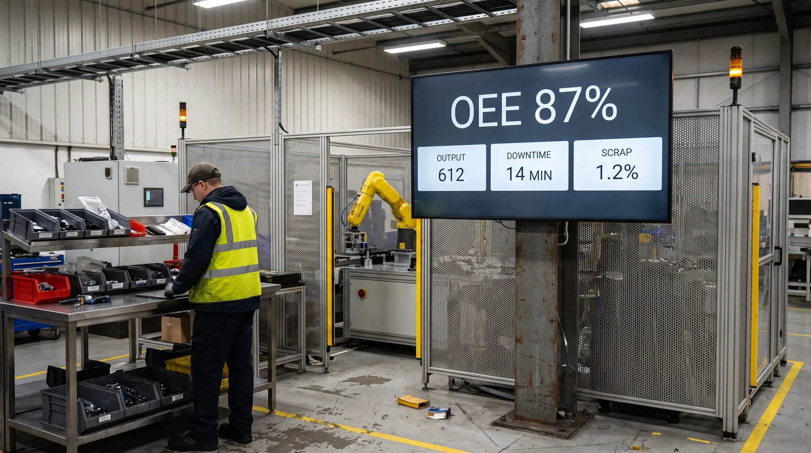
Where the numbers come from
Fugo is the display layer, not the data layer. It does not connect to a PLC, calculate OEE, or pull from an MES or ERP directly. It shows the dashboard your MES, BI tool or plant system already produces. If you can open it in a browser, Fugo can put it on a screen.
Show the dashboards you already built
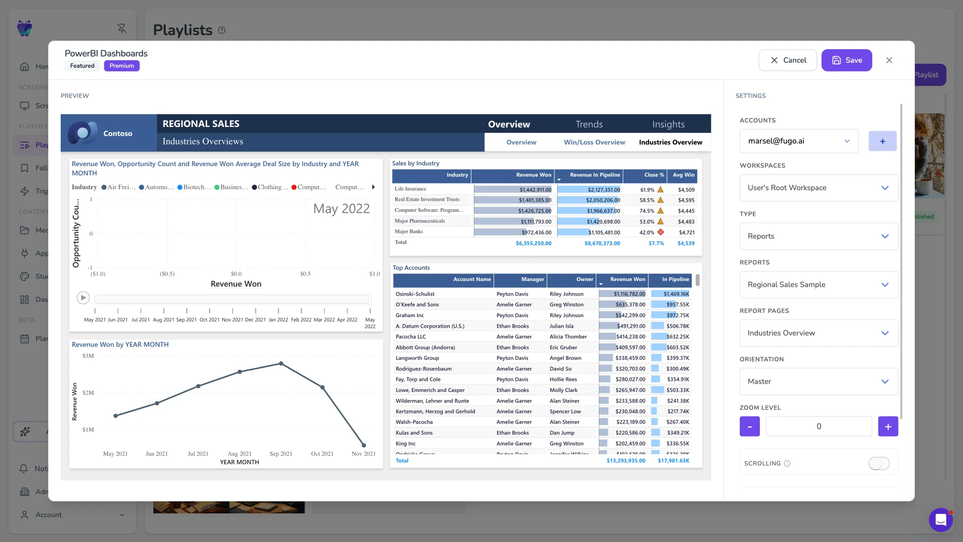
Most plants have already paid for the analytics. The gap is distribution. Fugo takes a dashboard URL and holds it on screen, refreshing on the interval you set. Common sources:
Power BI, plant reports and production workspaces
Grafana, sensor, equipment and infrastructure panels
Tableau and Looker Studio, plant and group-level reporting
Any internal web dashboard, including on-premise tools that never leave your network
Nothing to rebuild, no export step. The screen shows the same dashboard the plant manager sees, just larger and always on. Dashboards that sit behind a login are supported too.
Fugo is TV dashboard software for the whole plant. See Power BI on a screen and Grafana dashboards on screens, or check whether your tool is supported.
Digital andon boards and production display boards
An andon board makes a problem visible the moment it happens. Traditionally a light stack and a physical board. A digital andon board does the same job on a screen, and carries more: which line, which station, what the fault is, and how long it has been down.
A whiteboard is only correct at the moment it was written. A screen showing your live dashboard is correct all the time. With Fugo you can:
Run an andon view on line-side screens and a rolled-up plant view in the office
Use content triggers to switch a screen to a downtime or alert view when a condition you set is met, then switch back
Keep a production display board on a screen all shift, showing counts and targets rather than a whiteboard someone updates by hand
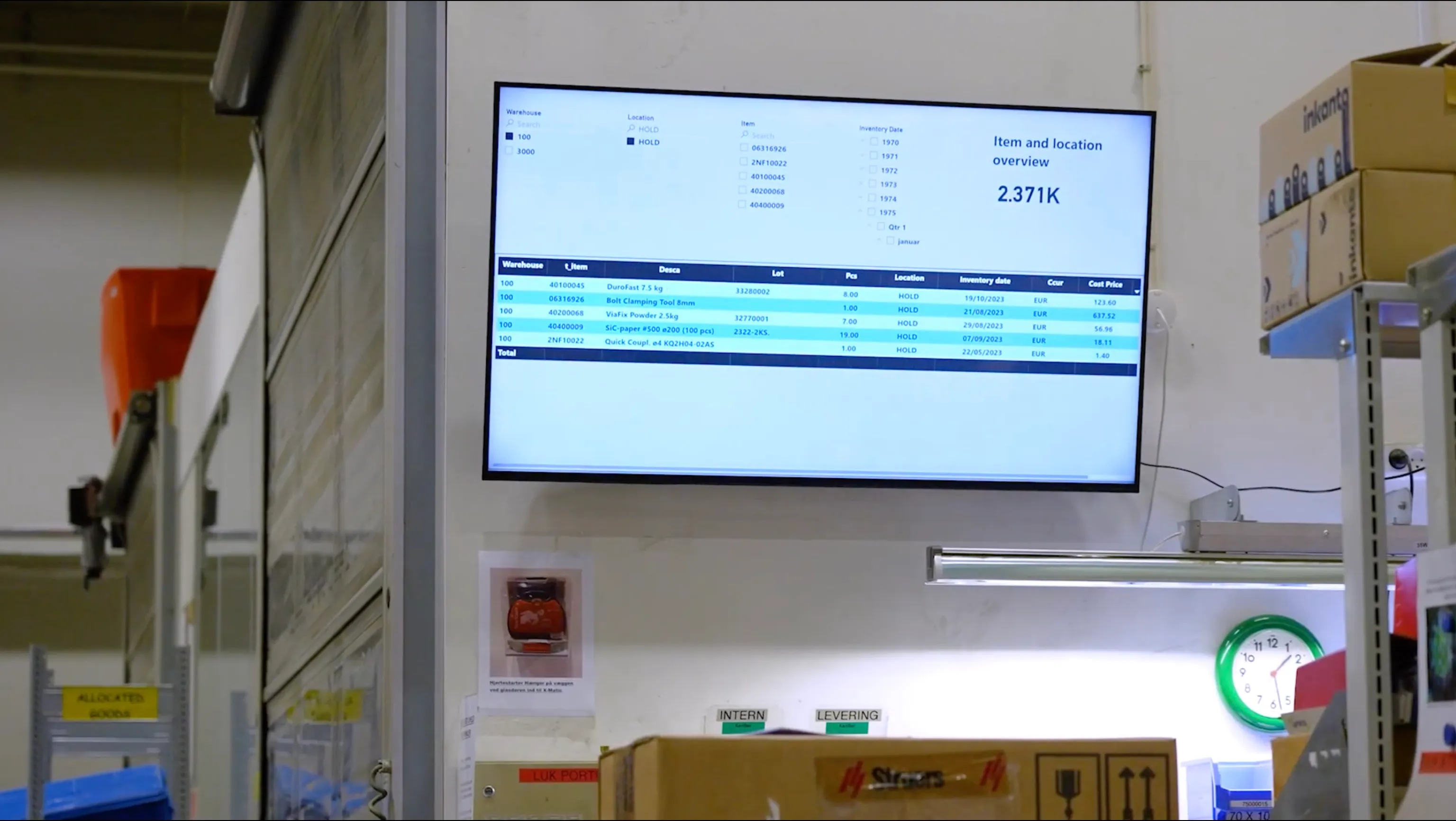
Screens that survive a factory
Shop floors are hard on hardware. Fugo is hardware-agnostic, so you match the player to the environment instead of buying into one vendor. Screen ruggedness, brightness and IP rating are a panel decision rather than a software one, so pick the display for the environment and run Fugo on it.
Amazon Fire TV Stick or the Amazon Signage Stick for low-cost office and break room screens
Google TV Streamer or NVIDIA Shield for Android deployments
Samsung Tizen and LG webOS built-in players, where a commercial panel with no external box is easier to mount and keep clean
Windows or ChromeOS devices where IT already has a standard build
Running screens across lines, plants and sites
One screen is easy. Forty screens across three plants is where signage projects fall over.
Playlists and scheduling let one plant show production data during shifts and safety or comms content between them, on a day-parting schedule you set once.
Screen groups mean a change pushes to every screen on a line, or every screen in a site, without touching them one at a time.
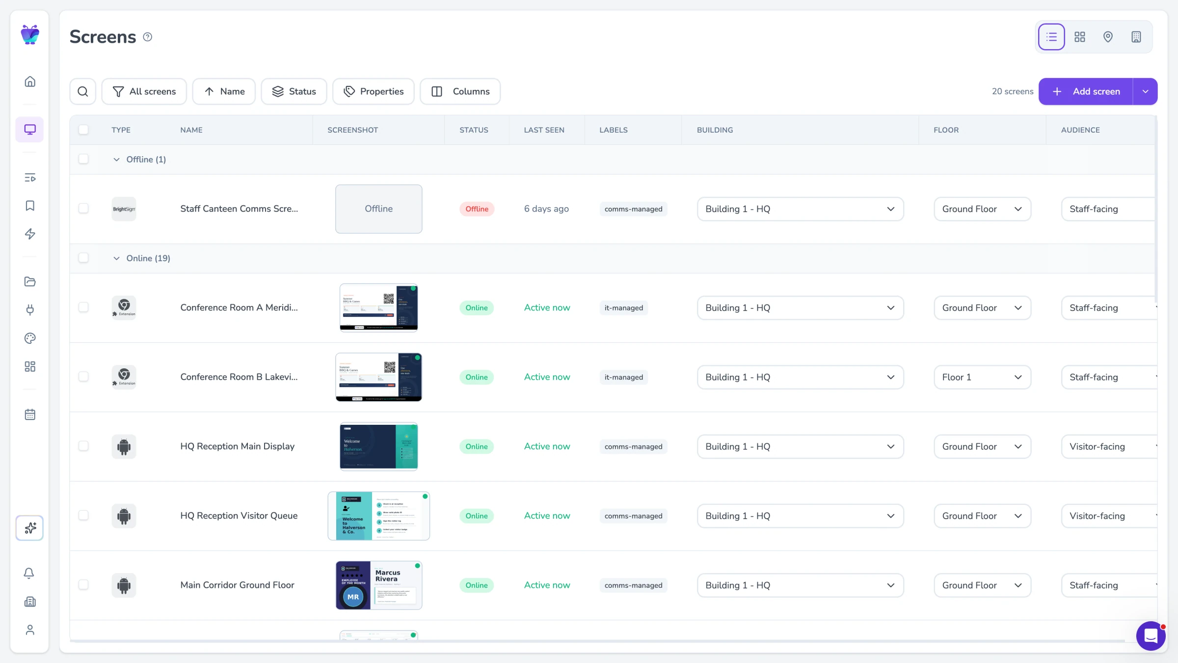
Uptime monitoring shows which screens are online. If one drops out mid-shift you see it on a dashboard instead of hearing about it a week later.
Remote screenshot and reboot let you confirm what a screen is actually showing and recover it without sending someone across the site.
SOC 2 Type II certification and per-screen pricing, so plant IT can scope both the security review and the cost before committing.
The same playbook runs the floor next door. See warehouse operations displays and the wider picture of digital signage for manufacturing.
Build the layout around the data
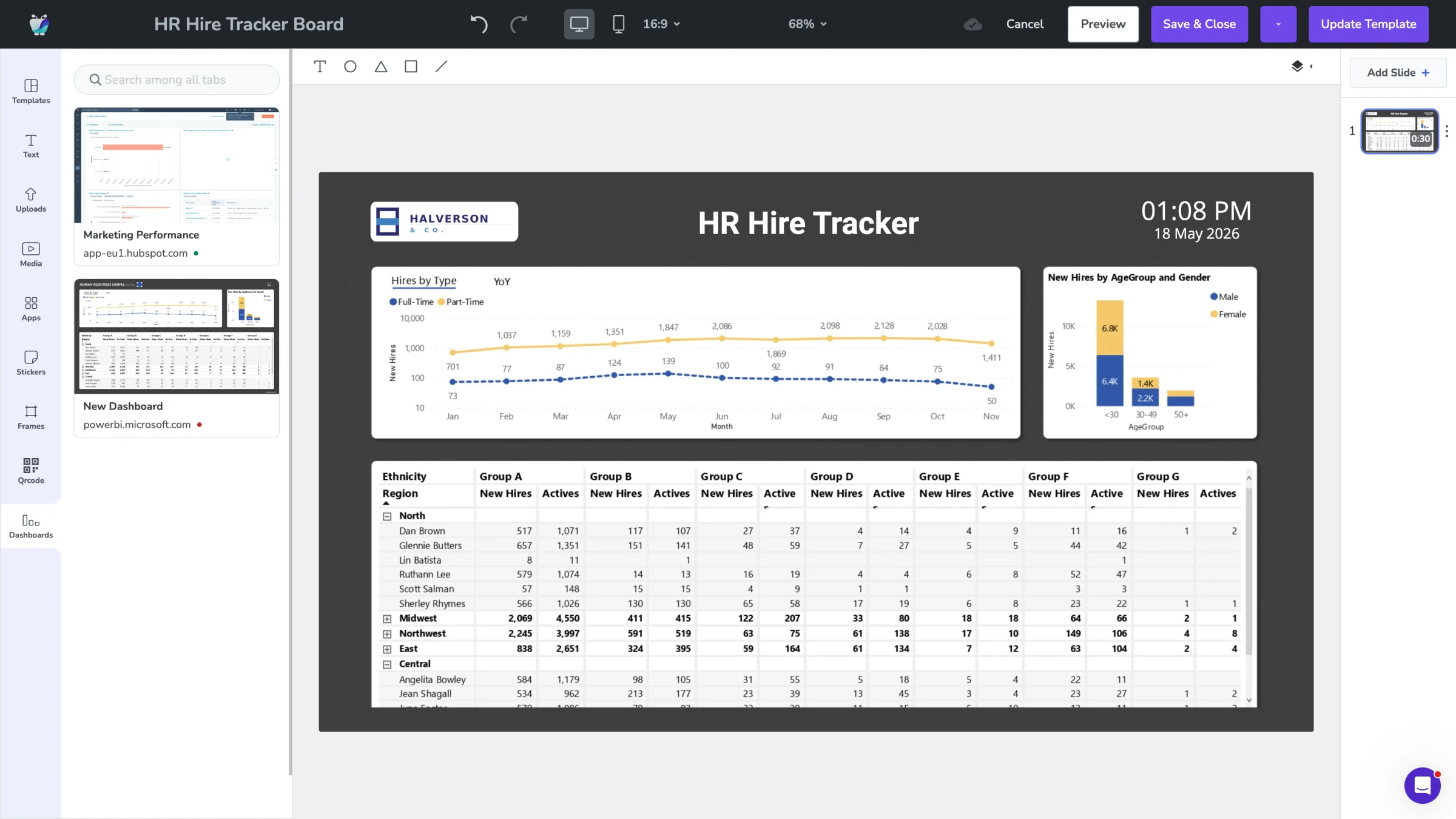
A raw BI dashboard is designed for a laptop, not a wall. Design Studio lets you build a shop floor layout: the production number large in the middle, quality metrics down one side, shift information along the bottom, plant branding at the top. Drag and drop, no design skills needed.
Templates give you a starting point, and assets pull through from your DAM if you use Canto, so plant screens stay on-brand without anyone re-uploading logos.
See it on your own dashboard
The fastest way to judge this is to watch your own production dashboard go up on a screen. Book a 20-minute demo and bring the dashboard URL you would actually use.